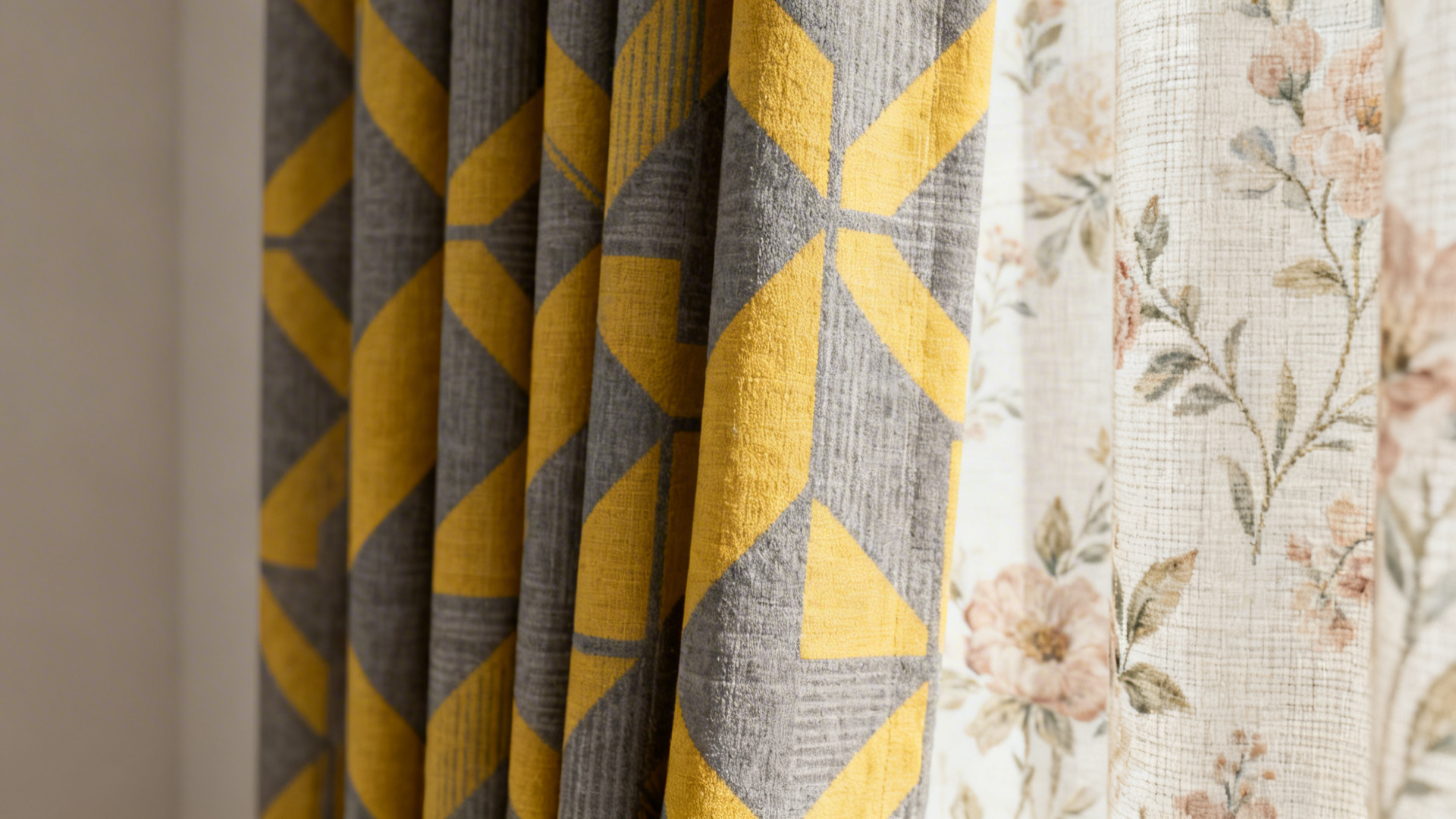
Gray And Yellow Living Room Curtains
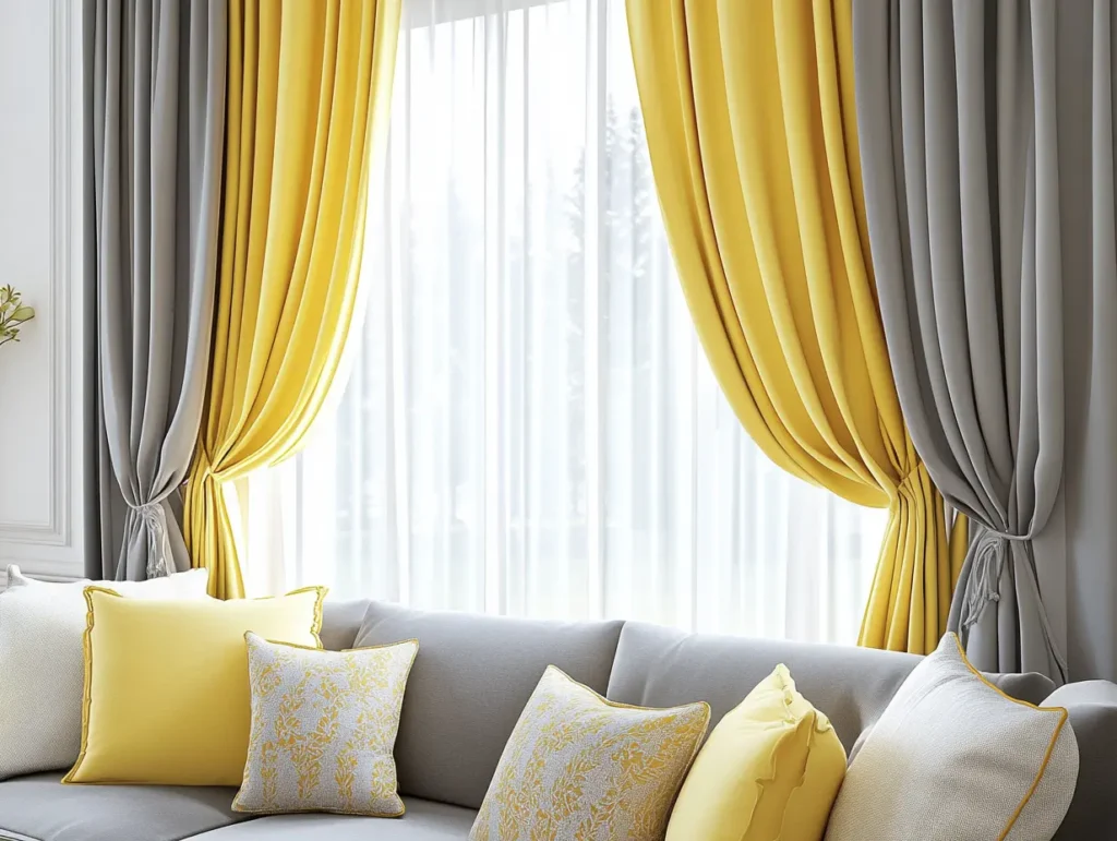
There’s a quiet confidence to a living room dressed in gray and yellow. It’s the sartorial equivalent of a tailored blazer paired with a sunny silk scarf—unexpected, chic, and endlessly versatile. Gray grounds the space with its cool, modern calm, while yellow injects a jolt of pure optimism, like a shot of espresso in your morning oat milk latte.
If you’ve been staring at blank windows wondering why your space feels “off,” this is your sign. Curtains are the unsung heroes of interior design, the final layer that dictates the entire mood. And this particular duo? It’s a masterclass in balance, offering everything from moody sophistication to effervescent charm without ever trying too hard.
The Psychology of the Palette
Before you swipe your card, let’s talk brain chemistry. Gray is the ultimate neutral—it’s the concrete jungle, the stormy sky, the quiet focus of a minimalist’s mind. It whispers “let’s lounge” while also saying “I read books and pay my bills on time.”
Must Read
Yellow, on the other hand, is pure dopamine. It’s the color of taxi cabs in New York, of sunflowers in a Van Gogh, of that first sip of Aperol Spritz on a hot terrace. Together, they create a visual rhythm: gray slows your heartbeat, yellow lifts your step. It’s a functional palette for modern living—calm, yet animated.
Which Shade Is Your Shade?
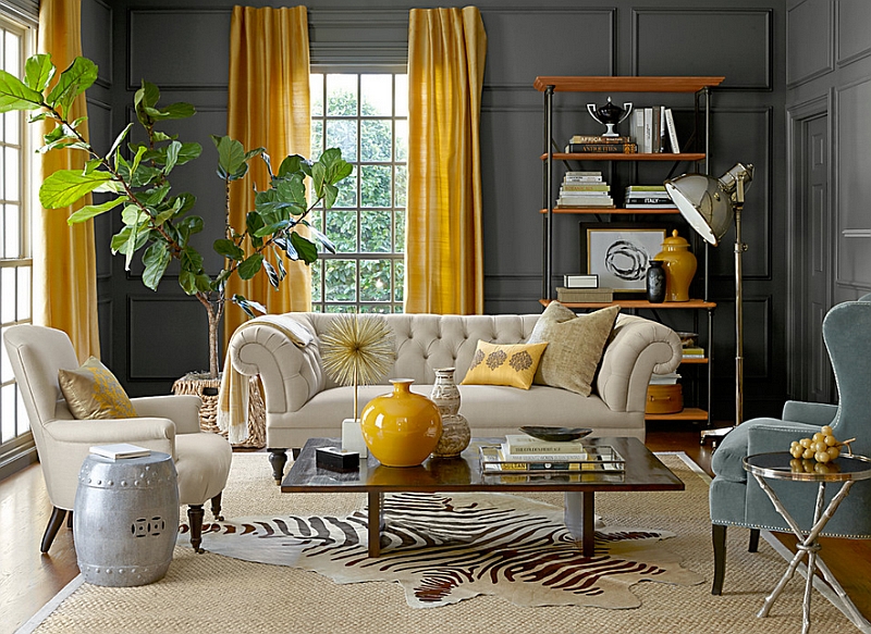
Not all grays are created equal. A charcoal gray with deep yellow sheers feels dramatic and gallery-like, perfect for a room with high ceilings. Conversely, a pale dove gray paired with buttery mustard velvet brings a cozy, hygge-inspired warmth that begs for a chunky knit throw.
Consider your lighting, too. North-facing rooms crave the sunnier end of the yellow spectrum—think marigold or goldenrod—to combat shadows. South-facing rooms can handle cooler, ash-toned grays and a softer, lemon-hued accent without overwhelming the senses.

The Art of the Hang
Here’s a fun fact: curtains should almost always be hung higher than the window frame. Mounting your rod four to six inches above the casing instantly makes your ceiling feel taller, and your living room feel more regal. With gray and yellow, this trick is gold—it elongates the vertical lines, letting the color do the talking.
For a bold look, commit to solid yellow panels against a gray wall. It’s a pop of energy that feels very Wes Anderson—symmetric, intentional, and slightly quirky. Feeling more timid? Flip it: use a warm gray as your main drapery and add a yellow trim or tassel for a playful, custom finish that costs pennies but looks bespoke.
Pattern Play Without the Stress
Fear of pattern is real, but the gray-and-yellow combo forgives all. Try a subtle geometric print—think thin gray stripes with a honey-yellow thread woven through. It adds texture without the chaos of a floral explosion.
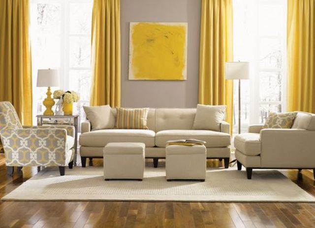
Alternatively, a block-printed design featuring abstract suns or muted checkerboards is having a serious moment right now. It feels contemporary, a little ‘70s, and very Scandinavian summer cottage—edge without the hard lines.
Styling Beyond the Window
Treat your curtains as a starting point, not a final destination. Echo the gray in a plush wool rug or a velvet sofa base. Then, scatter yellow accents—a ceramic vase, a stack of art books, a single blousy stem of dried eucalyptus—to create a visual echo across the room.
Don’t forget the hardware. Brass or antique gold rods are the perfect bridge between the cool gray and warm yellow. They act as the jewelry of the window, catching the light and reinforcing that luxurious, polished feel. Skip the silver; it makes the yellow look muddy.

Fun Fact: Did you know that yellow is the most visible color to the human eye? That’s why it’s used on caution signs and in rescue gear. In your living room, it’s a subtle safety net—guarding against blandness.
The Maintenance Reality
Let’s be real: yellow can show dust quicker than a black car after a rainstorm. But don’t let that scare you. Choose a performance fabric with a stain-resistant finish, or simply keep your panels on a weekly shake-out schedule. Steam them lightly, never over-iron, and they’ll keep their sunny disposition for years.
If you’re renting, use tension rods or clip-on rings to avoid committing to drill holes. You get all the joy of the color pop without the landlord grief—a win-win for temporary and permanent homes alike.
A Brief Cultural Nod
Think of the iconic scenes in The Grand Budapest Hotel—the muted lobby fabrics against the character’s vibrant uniforms. That’s the energy you’re channeling. Or recall the minimalist work of Japanese designers, where a single splash of color against a neutral backdrop is considered the height of sophistication.
In fashion, this pairing is timeless—think of a Chanel tweed suit (gray) with a silk blouse (canary). Your windows deserve the same haute-couture treatment.
At the end of a long day, when the sun begins to set, the gray will cocoon you, while the yellow holds onto the last flicker of daylight. It’s a quiet reminder that life isn’t about all-or-nothing extremes. It’s about finding the sweet spot between grounding and levity—between the storm and the sunshine. Pulling those curtains closed isn’t just about privacy; it’s about choosing which energy to wrap yourself in. And with gray and yellow, you’re always choosing hope, but with a very chic pair of glasses.
So go ahead, give your window a little therapy. Your living room—and your mood—will thank you.