Best Font For Excel Financial Reports

Okay, let’s be real for a second. You’ve just spent four hours wrestling a PivotTable into submission. Your formulas are finally singing in perfect harmony. And then you look at the output. It’s a wall of numbers that looks like a ransom note made from a dot-matrix printer. You deserve better. Your boss deserves better. Heck, the numbers deserve better.
So, what’s the best font for your Excel financial reports? Spoiler alert: it’s not Comic Sans. Unless you’re reporting to a seven-year-old, in which case, carry on. We’re looking for clarity, professionalism, and a hint of “I know what I’m doing” energy. Let’s dive into the font rabbit hole, shall we?
The Usual Suspect: Arial
Arial is the vanilla ice cream of fonts. It’s fine. It’s everywhere. It’s the default, and honestly, it’s a little boring. But boring is safe, right?
Must Read
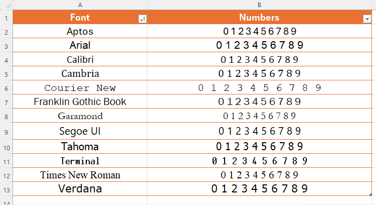
For financial reports, Arial gets the job done, but its numbers can feel a bit… squished. When you have a column of $1,000,000 next to $999,999, you want to see that difference instantly. Arial sometimes makes those digits look like they’re playing a game of Tetris. It works, but there’s no zip to it.
Enter the Hero: Calibri
Ah, Calibri. The default for everything Microsoft since 2007. It’s like the reliable friend who always shows up with a pizza. It’s clean, modern, and has a softer, rounder look than Arial. But here’s the kicker—it’s taller.
Those taller characters make numbers easier to read at a glance. You’re less likely to mistake a 3 for an 8 when they have a bit more breathing room. For a financial report, this is huge. It’s like upgrading from a flip phone to a smartphone. Same function, but a much better experience.
The Secret Weapon: Consolas
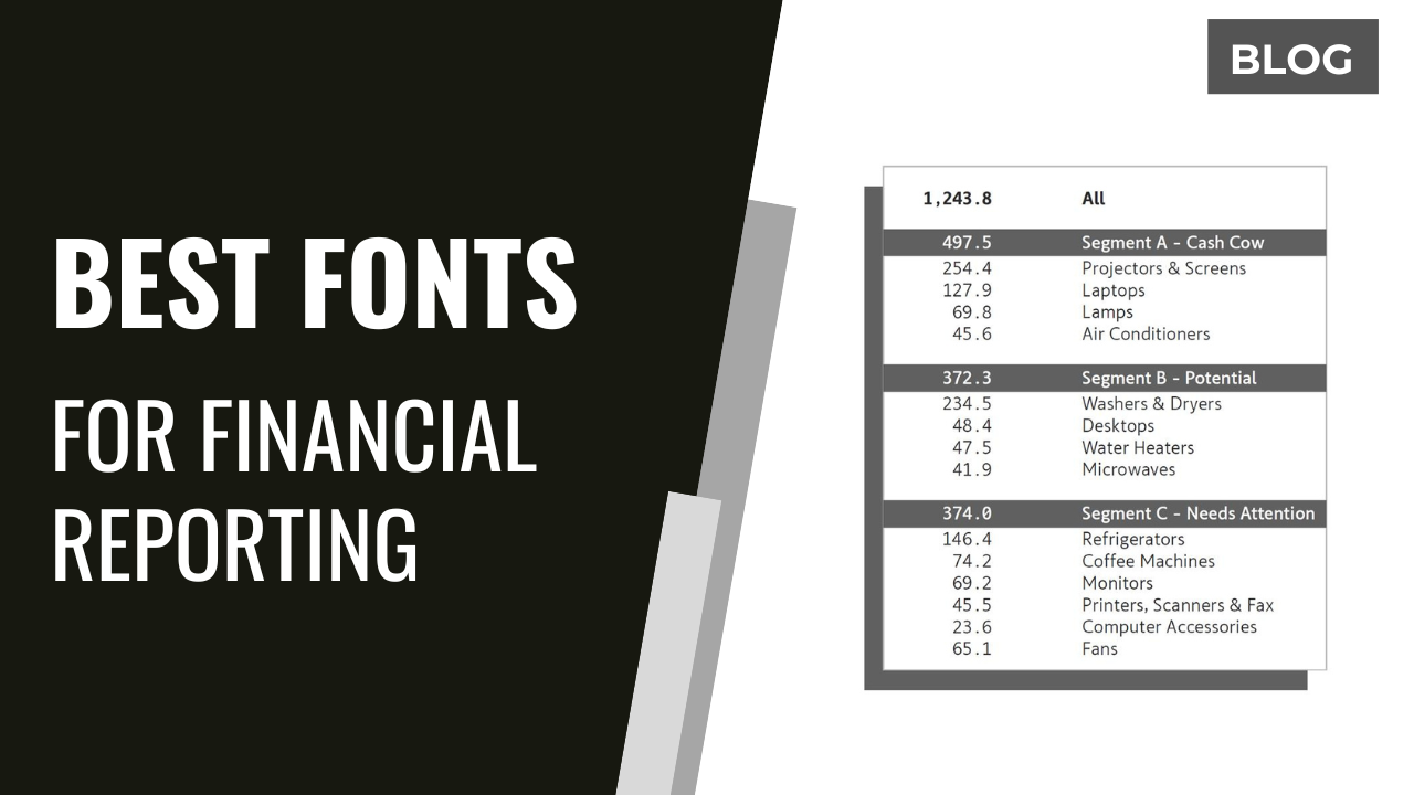
Now, let’s talk about the underdog. The hipster choice. The one that makes accountants swoon. Consolas is a monospaced font. That means every single character takes up the exact same amount of space. Yes, even the letter “i” and the letter “W”.
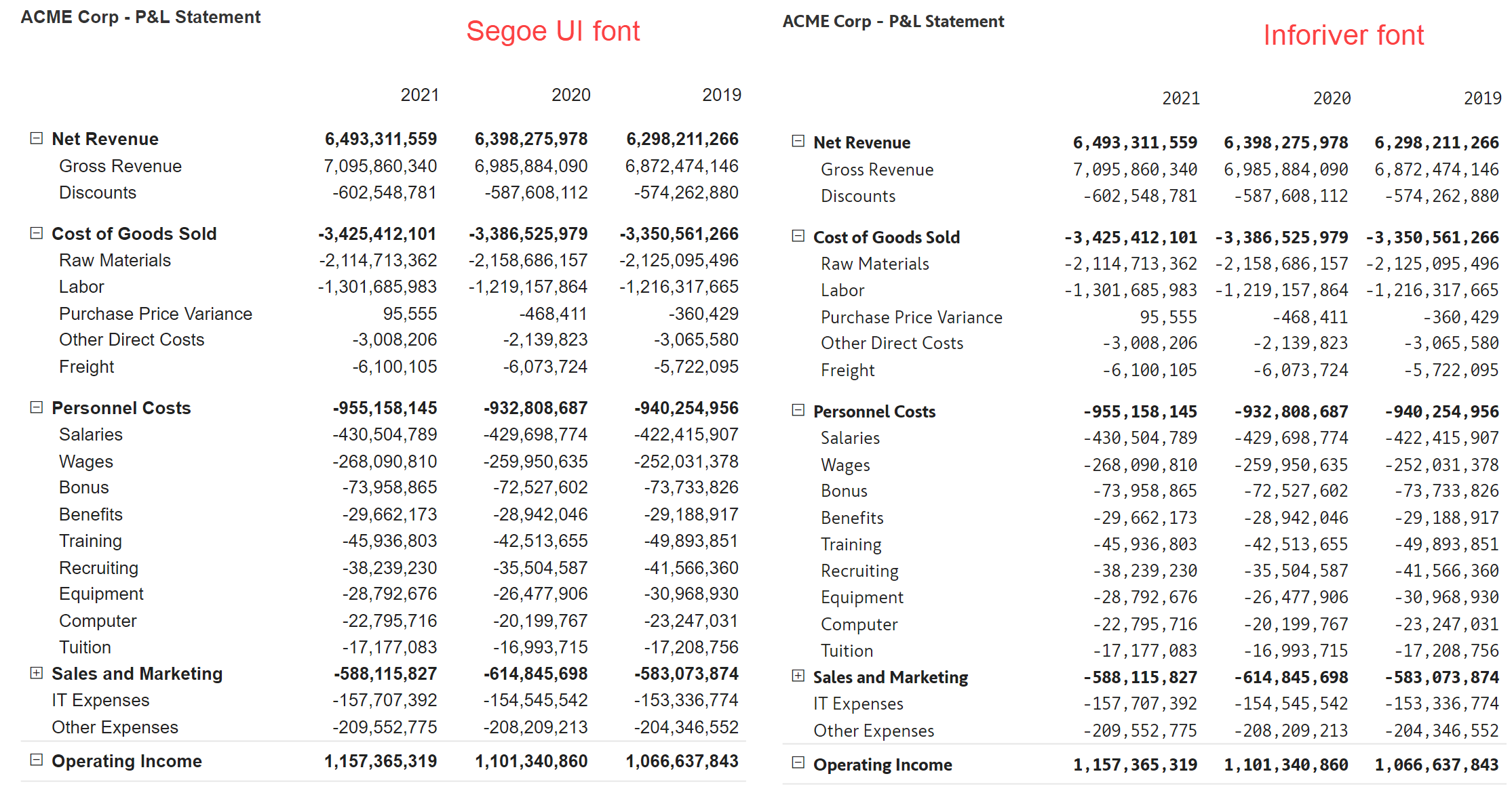
Why does this matter? Because when you have a column of numbers, they all line up perfectly. Right-aligned numbers become a thing of beauty. You get these crisp, vertical lines of digits that just flow. It feels like reading a financial poem. It’s nerdy, yes, but it’s also ridiculously effective.
But Wait, Is It Professional?
I know what you’re thinking. “Consolas? That’s a coding font! My CFO will laugh me out of the room.” Hear me out. It looks technical, but in a deliberate, “I’ve got this under control” way. It screams precision.
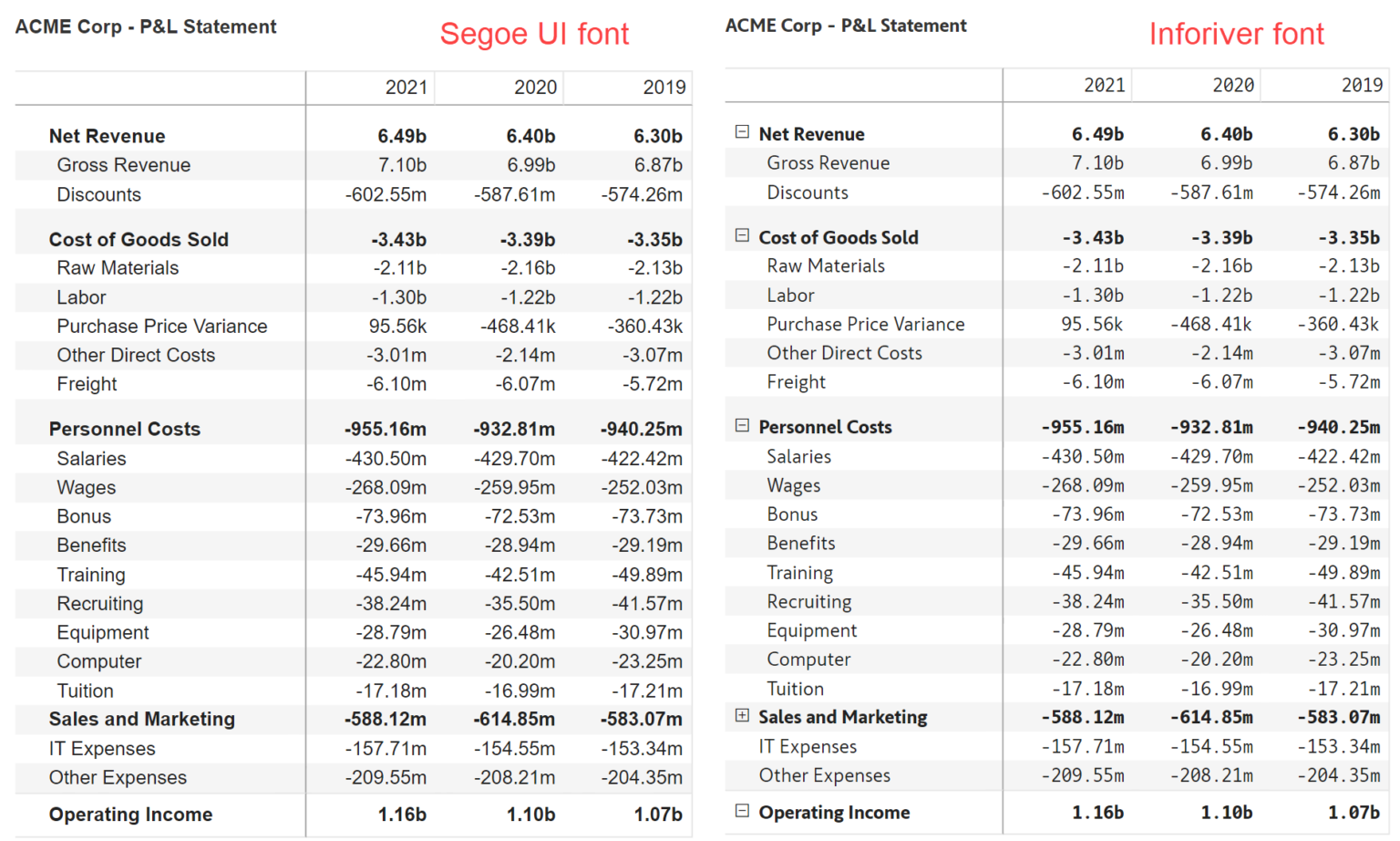
If you’re sending a budget to someone who squints at tiny print, Consolas is a blessing. The uniform spacing kills the visual chaos. Try it on a small table. You’ll never go back. Just promise me you won’t use it for an entire paragraph of prose. It’s a tool, not a lifestyle.
The Old-School Classic: Times New Roman
Oh, Times New Roman. You’re like that dusty leather chair in a law firm. You smell like old paper and importance. This font says, “I’ve been doing this since the 80s and I’m not changing now.”
It’s a serif font, with little feet on the letters. Those feet can actually guide the eye along a line of text. For a long, dense financial summary, it’s not a terrible choice. But for tables and spreadsheets? It feels a bit clunky. The numbers often have varying widths, which can make columns look ragged. It’s like bringing a horse to a Formula 1 race. It’s classy, but it’s not built for speed.
Let’s Talk About a Hidden Gem: Aptos
Have you met Aptos yet? It’s the new default font that Microsoft is rolling out, and honestly, it’s a game changer. It’s like Calibri’s more handsome, more athletic sibling. It’s clean, modern, and has a very neutral, friendly vibe.
For financial report titles, headings, and notes, Aptos is chef’s kiss. It feels fresh without being trendy. Pair it with Consolas for your data tables, and you’ve got a winning combo. That’s the secret sauce, right there.
So, What’s The Verdict?
Alright, let’s cut to the chase. For your data-heavy cells, use Consolas. Trust me on this one. The alignment is so satisfying it might become your new favorite thing. Seriously, after you try it, you’ll start looking for other places to use it.
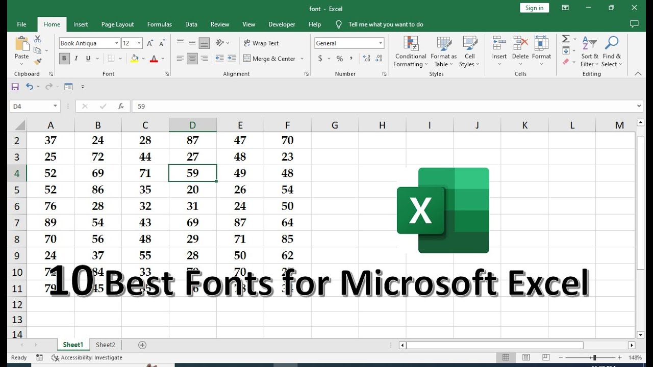
For your headings and summary text, stick with Calibri or the new Aptos. They’re readable, professional, and won’t make anyone question your sanity. Avoid Times New Roman unless you’re printing a legal contract to frame on a wall.
And whatever you do, please don’t use Papyrus. If you see Papyrus on an Excel report, you’re probably in a sci-fi movie about a lost civilization’s tax forms. Let’s keep it simple, folks.
The goal is to make your numbers look as smart as you are. A clean font does half the heavy lifting. So go ahead, change your font. Play around with it. Your eyes (and your sanity) will thank you. Now, go forth and make those spreadsheets look expensive.