Add Automatic Subtitles To Video
Remember when watching a video on your phone in public meant either subjecting yourself to a jarring blast of audio or staring intently at a tiny screen while mouthing “what did they say?” to your equally confused friend? That era is stone dead. We are currently living through the Great Captioning Boom, a seismic shift in digital consumption where subtitles are no longer the clunky, yellow-text-on-black-box assistive technology of yesteryear. They are now a stylistic choice, a comedic timing device, and arguably the most critical piece of marketing fuel since the hashtag. The internet didn’t just ask for accessibility; it demanded that text pop, bounce, and slap across the screen with the energy of a caffeinated graphic designer. And if you aren't adding them to your video content, you're basically whispering into a hurricane—nobody hears you, and frankly, nobody cares to try.
This isn't just about the deaf and hard-of-hearing community (though their decades-long advocacy is the foundation upon which this trend is built). This is about the 80% of social media users who watch videos on mute while scrolling through their feeds during a work meeting or on a packed subway car. The algorithm gods have spoken, and they favor retention. If a viewer doesn't latch onto your video within the first 1.7 seconds, it’s buried in the digital wasteland. Text is the hook. The sudden explosion of AI-generated, hyper-stylized captions—the kind with word-by-word highlighting that moves like a karaoke bar on acid—has turned every vlogger, chef, and dog account into a broadcast network. It’s a strange paradox: in a world obsessed with realism and unpolished content, the most authentic way to communicate has become a layer of highly processed typography over our imperfect lives.
So, what is the vibe? It’s the aesthetic of a mid-2000s music video mixed with the urgency of a breaking news ticker. It’s the difference between a "video" and a "piece of content." And right now, if you aren't exploiting this, you are leaving serious clout on the table. But before you go downloading dodgy freeware and producing a digital eye-sore, let’s dissect this phenomenon, figure out how to avoid the cringe, and understand why your feed is now permanently plastered with moving words.
Must Read
The Subculture of the Silent Scroll: Why We Love Text But Hate Talking
There is a fascinating, slightly toxic subculture thriving in the comment sections regarding subtitles. On one side, you have the "Caption Purists"—the users who will instantly call out a misspelled word in a subtitle with the ferocity of a grammar police raid. They flood comments with "It’s ‘definitely,’ not ‘definately,’" completely ignoring the video’s content. On the other side, you have the "Anti-Caption Rebels"—the boomers and contrarians who complain that subtitles are "covering up the good parts" of the video, as if the text is a personal attack on their eyeballs. This battle for screen real estate is absurd and strangely captivating. The Caption Purists have inadvertently birthed a new genre of "caption fail" compilations, where creators intentionally make typos to bait engagement. It’s a meta-commentary on how we interact with text versus audio.
The deeper cultural shift, however, is the rise of the "Silent Gen Z" communication style. We have moved from watching to reading video. The social dynamic now dictates that audio is a private luxury. You wear earbuds not to enjoy the sound, but to keep others from hearing your phone. When you walk into a waiting room, the soundscape is dead silent, but every screen is glowing with frantic, animated text. This has transformed how creators write their scripts. We are now crafting sentences for the eye, not the ear. The rhythm has changed—sentences are shorter, punchier, and packed with visual cues. Moreover, the rise of "text-based storytelling" on TikTok, where a video is essentially a silent movie with voiceover text as the narrator, proves that we have fully inverted the medium. We aren't watching a person talk; we are reading a person’s vibe. It’s a bizarre literary genre, and the grammar rules are still being written in real-time by teenagers with access to CapCut.
The Pragmatic Pros' Guide to Auto-Caption Dominance (Without Losing Your Mind)
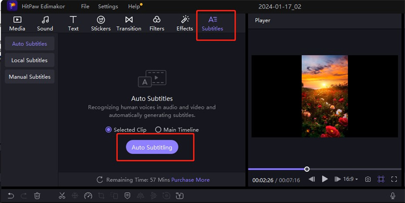
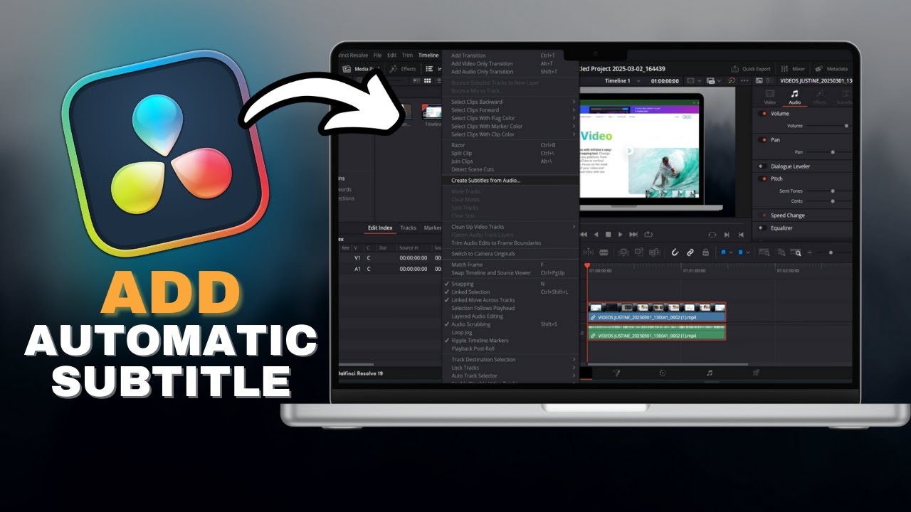
Alright, you’re convinced. You need subtitles. But if you download the first free app you see, you will be greeted with cringey, robotic text boxes that cover your face and a font that screams "corporate PowerPoint." The goal is not just to be understood; it is to be observed. First, abandon the idea of "burning in" simple static subtitles. We are in 2025, and the bare minimum is animated, word-by-word highlighting. Whether you use the built-in auto-captions on Instagram Reels or TikTok, the default is usually okay, but never great. The key is to treat the auto-caption tool as a rough draft. You must edit the AI’s hallucinations. If you speak quickly, the AI will butcher names, turn "typically" into "tipically," and create a grammatical catastrophe that will have the Purists frothing at the mouth.
Your next step is to invest in the B-Font. You know the one. That massive, white, bold sans-serif with a heavy black outline that sits at the bottom third of the screen. Yes, it blocks the chest of the speaker. Yes, it covers up half the background. But it works. It is the visual equivalent of a shot of espresso. However, you must adjust the positioning. If you are speaking, place the text in the "safe zone"—just above the middle lower-third, but below the center of the screen. This is so people’s phones with 100% screen brightness don't get blasted by white text. If you don’t, you’ll burn retinas faster than a solar eclipse. Also, please, for the love of all that is holy, match the text color to your brand or the video’s mood. Neon green on a pastel background is a vibe; plain white on a white wall is a horror movie.
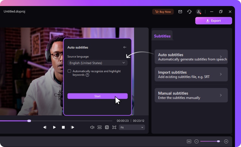
Here is where the sanity check comes in: you do not need to pay $50 a month for a professional transcription service if you are just a regular person. The native auto-caption tools are surprisingly powerful. But here is the trick—run the auto-captions, then read them out loud as you watch the video. If the timing is off by even a fraction of a second, it feels like a bad dub of a kung-fu movie. The text should appear exactly as the word is spoken, not before, not after. Also, consider the tempo. If you are a fast talker, make sure the caption duration is long enough to read but short enough to keep pace. If you are a slow talker, try to speed up your delivery in the edit, or the video will feel like watching grass grow. Subtitles amplify the energy of your speech, so if you sound bored, the text will look bored.

Finally, embrace the "Emphasis Tool." Most advanced editors allow you to change the color of specific key words mid-sentence. This is not just for aesthetic pleasure; it’s a psychological trick. By making one word pop out in yellow or red, you dictate the viewer’s focus. It creates impact and can even shape the joke. The internet is a skimming culture. Viewers will not watch your entire two-minute rant; they will skim the text. If your captions are a block of uniform letters, you lose them. If they see "DON'T, I repeat, DON'T do this," with "DON'T" in huge red letters, you’ve got their attention. This is the true trick of the trade: using the subtitles not as a translation of your speech, but as a visual choreography of your emotional intent. Stop treating them as an afterthought; treat them as a teleprompter for the audience’s soul.
The Talking Head Q&A: Debating the Textual Revolution
1. "Do auto-subtitles hurt my watch time if my video is long-form?"
This is the great debate. On platforms like YouTube, the algorithm uses retention rate. Long-form content (over 10 minutes) often sees a dip in retention initially, but captions can actually help you claw back that attention. Why? Because they cater to the "completionist" viewer who is watching at 1.5x speed. When a viewer speeds up your video, your natural voice becomes a chipmunk-like garble. But the subtitles remain readable. Therefore, auto-subtitles are the only way to communicate with the speed-demons. They allow the viewer to digest the information faster than you speak, which ironically keeps them engaged longer because they don't have to rewind to understand what you said.
On the flip side, there is a psychological friction. If you have huge, chunky subtitles on a 30-minute educational video, the screen becomes visually exhausting, and the viewer might click off due to "visual overload." The answer is to offer dynamic captions that can be toggled on and off. In long-form, don't burn the text into the video. Upload a clean file and use YouTube’s powerful built-in subtitle editor to create a SRT file. This allows viewers to adjust the font size and background themselves. For short-form, burn them in. For long-form, let the viewer control their destiny. It is the difference between a lecture and an immersive reading experience. If you force the text down their throat for 20 minutes, they will choke. Give them the choice.
2. "Is it cheating to rely on AI transcription errors to go viral via 'caption fail' compilations?"
Ah, the dirty secret of the industry. Yes, some creators intentionally say words that sound similar to profanity or absurd phrases, hoping the AI will subtitle it incorrectly, thereby creating a "gotcha" moment that gets clipped and shared. This is a cynical, yet effective, strategy. It feeds our societal obsession with catching mistakes. It also highlights a very real technological limitation. While AI has gotten incredible, it still has no context. It doesn't know if you are talking about a "bear" or a "bare" market, a "tea" or a "tee".
However, relying on this is a house of cards. It’s a cheap laugh, and it usually results in the video being placed in a compilation video by a guy with 10 million followers who edits it with elevator music. You get the engagement, but you also get the label of "sloppy." The more sophisticated "cheat" is to intentionally subtitle a word wrong in the actual edited text—while the audio says one thing, the text says another—creating an inside joke the AI never touched. This is a deliberate creative choice. But leaving a glaring AI error in is just lazy. The viral "fails" are funny, but they are one-hit wonders. Build the joke, don't become the joke.
3. "What font should I actually use to look professional without looking like a boring news channel?"
This is the most contentious issue in the creator economy. The default "Montserrat" or "Arial Bold" is the safe choice, but it’s the equivalent of wearing a gray suit to a rave. The viral aesthetic right now is "Monument Extended" or "Anton"—massive, condensed, high-contrast fonts that look like they belong on a movie poster. They take up space, they scream confidence, and they are extremely legible at small sizes. Avoid script fonts, serif fonts, and anything with thin stroke weights. If your phone screen is at 50% brightness and the sun is glaring, a thin font will vanish into the void.
Also, consider the spacing. "Tracking" (the space between letters) should be slightly increased for readability. The background shadow or outline is non-negotiable. If you want to be trendy, use a low-opacity, semi-transparent black box behind the text instead of a hard outline. This creates a "modern" look and ensures the text doesn't clash with the background image. And the ultimate rule: never, ever use yellow if you are not a major sports network. Yellow text is the '00s. We are in the era of stark white with a pop of color for keywords. Keep it clean, keep it massive, and keep it moving.
Is this a fad? It is tempting to think of this as a bubble that will burst when we all get bored of reading our screens, but the fifth-generation wireless (5G) and smartglasses will only augment this reality, not diminish it. As long as we live in a world where we are bombarded with stimuli, the ability to quickly scan and digest information without committing to audio will remain the most attractive feature of a video. The "silent mode" is not a feature of our phones; it is a feature of our minds. We have trained ourselves to read faster than we listen. That is not going to reverse itself.
However, the stylistic execution will change. The giant, blocky text of 2024 might look as dated as the "Impact" font memes of 2010 look today. But the underlying principle—that visual typography is the primary driver of narrative engagement—is here to stay. The future isn't video; it's readable video. So, get used to the alphabet soup. It’s the only way we are going to understand each other in this beautifully chaotic, wonderfully loud, but ultimately silent digital existence.