Qlik Sense Sales Dashboard Examples
Alright, friend, let’s talk dashboards. Not the boring, spreadsheet-on-a-screen kind that make your eyes glaze over faster than a PowerPoint on a Friday afternoon. I’m talking about Qlik Sense sales dashboards—the ones that actually make you feel like a data wizard, not a data entry clerk.
If you’ve ever stared at a pile of sales numbers and thought, “I’d rather reorganize my sock drawer,” you’re in the right place. Because today, we’re diving into some real-world examples that are so intuitive, you’ll swear your computer is reading your mind. Or at least, reading your sales pipeline without judgment.
Why Qlik Sense? Because It’s Not Just a Chart Drawer
First things first—why do we even care about Qlik Sense? Well, unlike your ex, it actually associates everything for you. You click on a region, and boom, the whole dashboard reacts like a well-trained puppy. That’s the associative engine working its magic, and it makes exploring data feel like a game, not a chore.
Must Read
Plus, it’s designed for humans. You don’t need a PhD in SQL to build something useful. You need curiosity, a coffee mug, and maybe a slightly reckless attitude toward drag-and-drop actions.
Example #1: The “Big Picture” Executive Overview
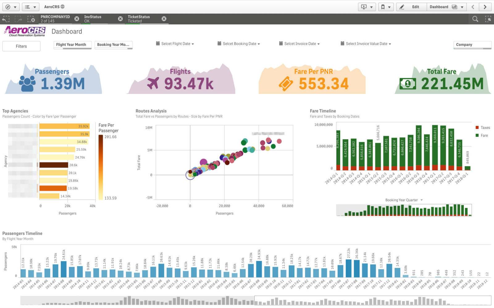
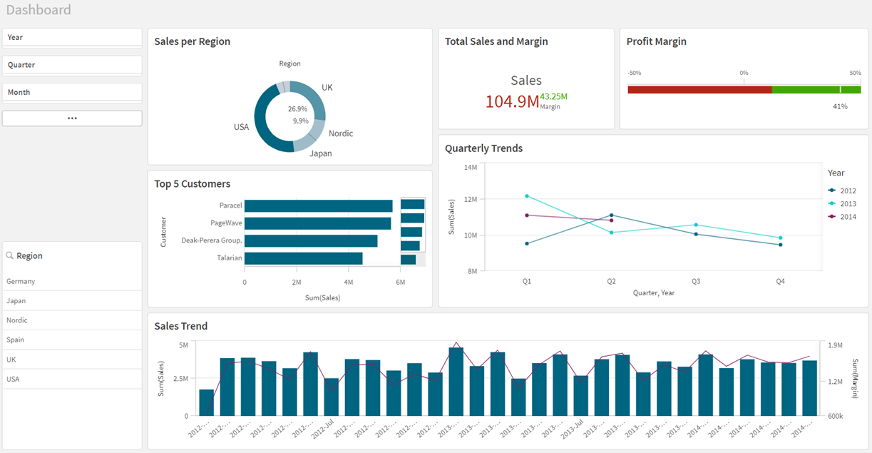
Imagine you’re the VP of Sales. Your boss just waltzed in and asked, “How are we doing?”—and you need an answer that doesn’t involve sweating or fumbling. The Executive Overview dashboard is your knight in shining armor. It’s a hero shot of KPIs: total revenue, average deal size, win rate, and pipeline coverage—all sitting pretty in giant KPI tiles.
The beauty? You can spot a slump in Q3 from across the room, like a hawk spotting a tiny mouse. And if the numbers look rough, you can blame the data, not yourself. That’s the secret to executive survival.

Example #2: The “Where’s My Money?” Regional Breakdown
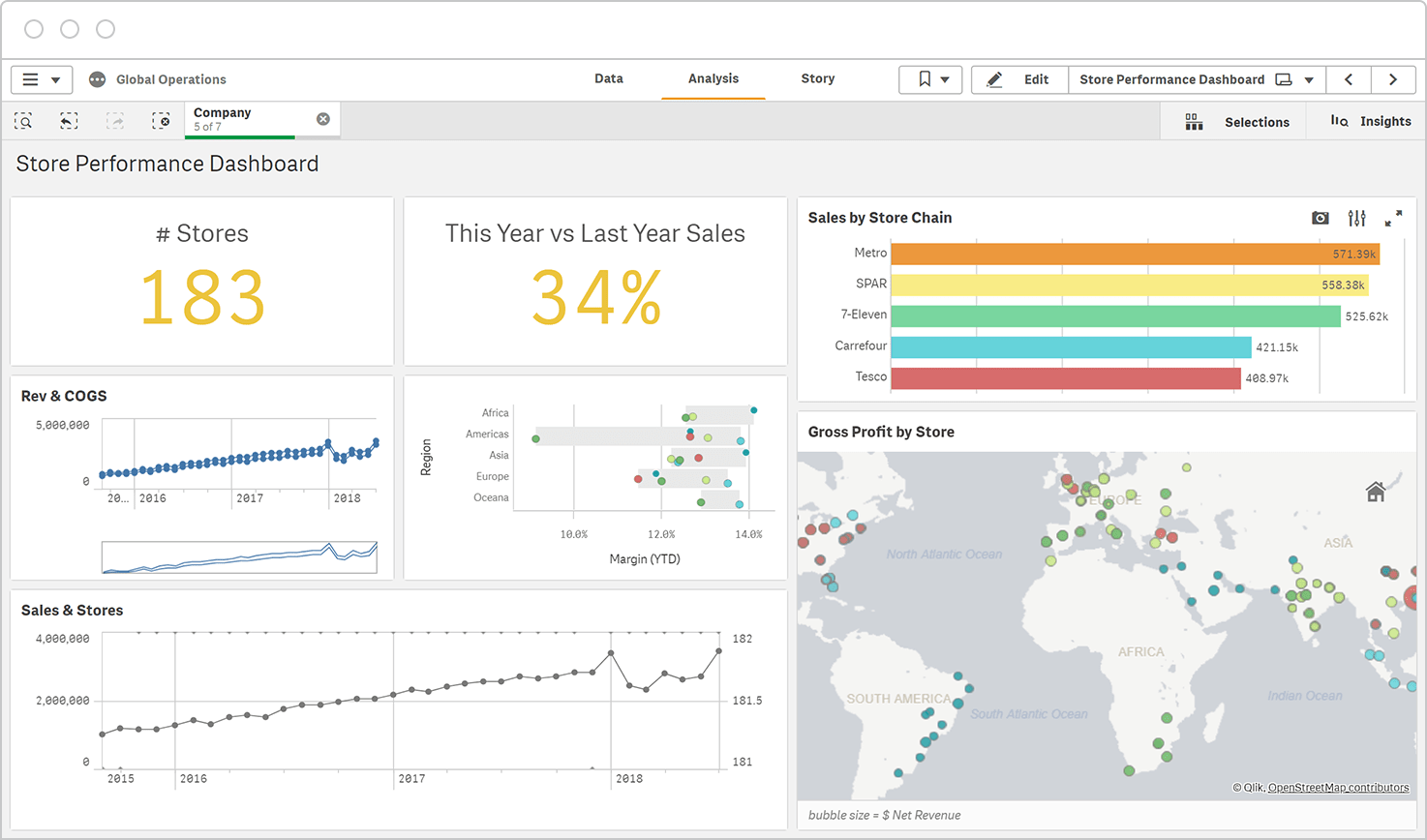
Now let’s zoom in. You’ve got sales reps in New York, Austin, and a guy in his garage in Nevada. A geographic sales dashboard is your cartographer. It uses maps and color-coded bubbles to show which territory is crushing it and which one is… well, practicing for the Olympics in participation.
You can drill down from country to ZIP code faster than you can say “quota.” This is the dashboard that answers the age-old question: “Why is the West Coast always outperforming the Midwest?” (It’s because of the time zones, obviously. They get a three-hour head start on good decisions.)
Example #3: The “Who’s the MVP?” Rep Performance Tracker
Let’s get personal. This dashboard is the sales manager’s best friend and the rep’s friendly rival. It ranks your team by deals closed, activity calls, and average deal time. You can see who’s a closer, who’s a chatterbox, and who’s been napping through Zoom calls.
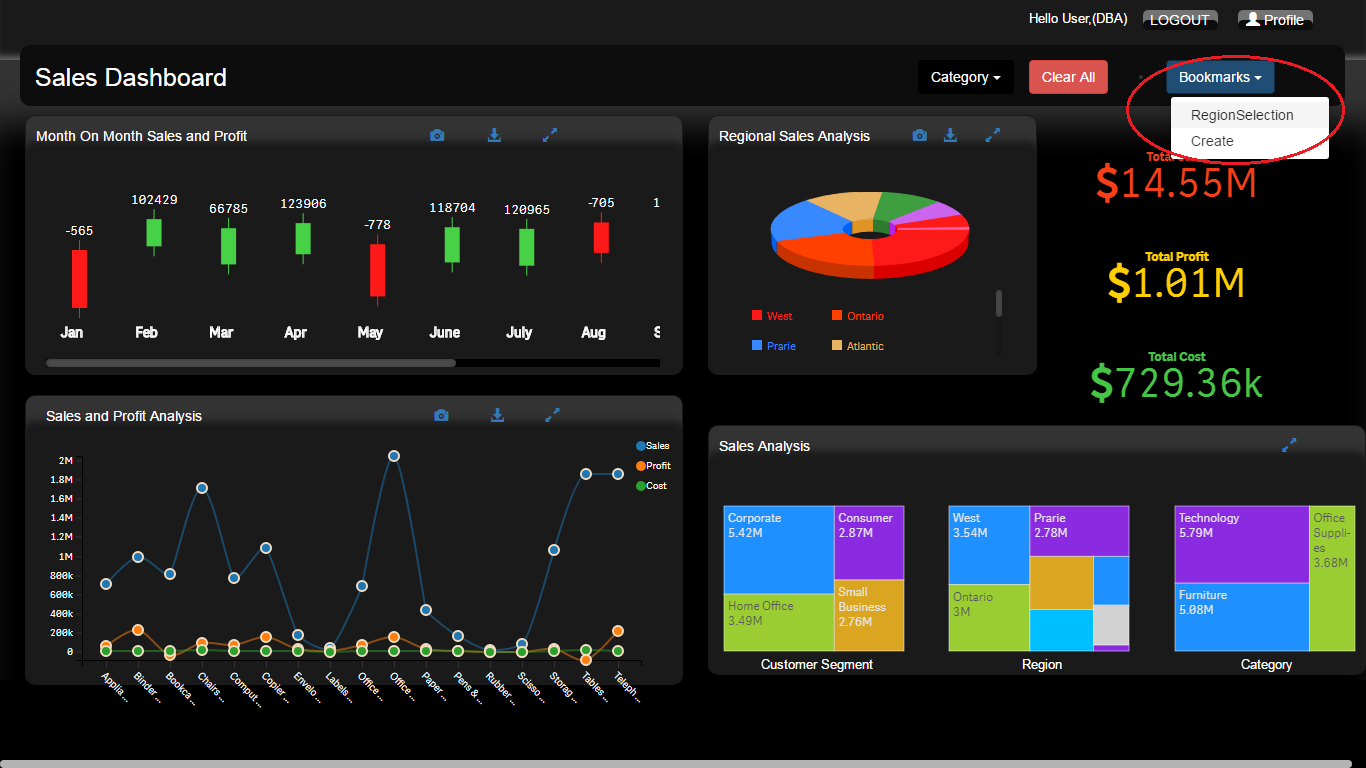
But here’s the kicker—Qlik Sense makes it fun. You can set up a “leaderboard” style view with little progress bars. Suddenly, your team is competing for the top spot like it’s a video game. Warning: side effects include increased office morale and occasional trash talk. Totally worth it.
Example #4: The “Crystal Ball” Sales Forecast
Forecasting is like predicting the weather—except if you’re wrong, your CFO asks why you didn’t bring an umbrella. A predictive sales dashboard in Qlik Sense uses past trends to project future revenue. It shows you expected close dates, probability percentages, and likely bottlenecks.
You’ll be able to say things like, “I predict a 68% chance we hit quota next month, and a 32% chance we’re all working weekends.” It’s not magic. It’s just machine learning with a great sense of timing.
Example #5: The “Fine, Let’s Look at the Pipeline” Funnel
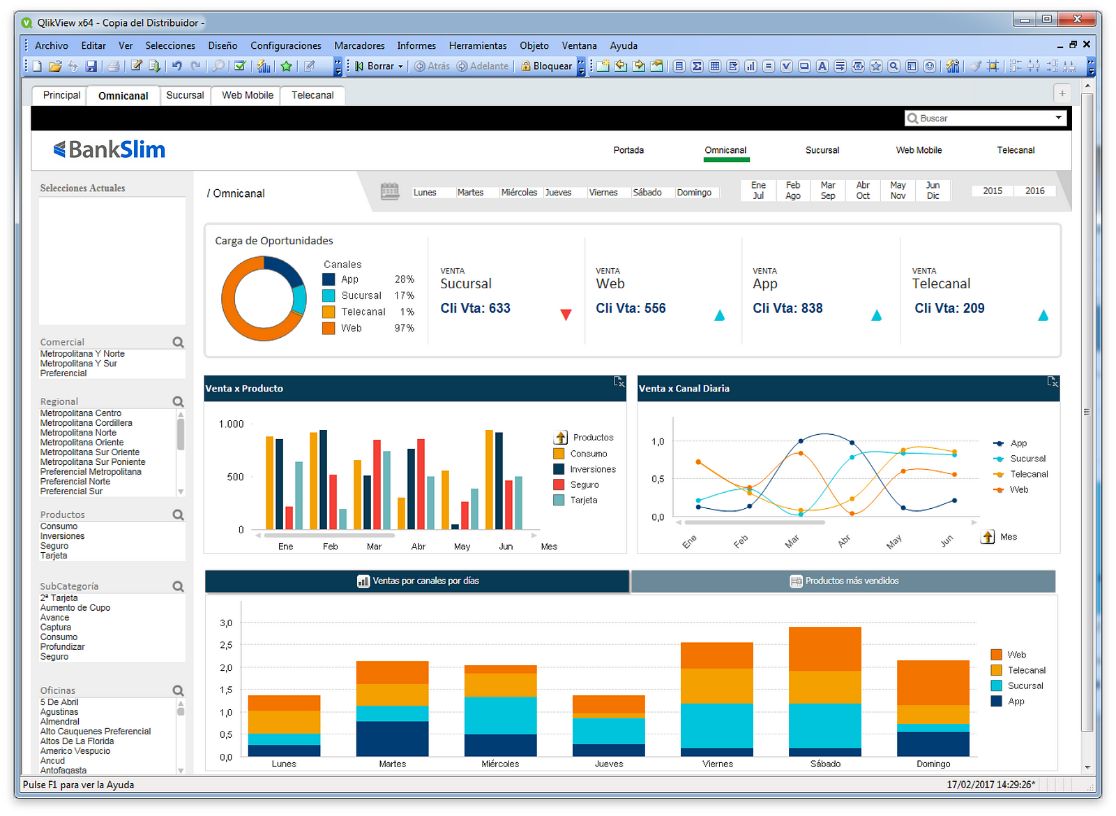
Ah, the classic sales funnel. You know it: leads at the top, closed deals at the bottom, and a whole lot of “maybe” in the middle. A Qlik Sense funnel dashboard shows you conversion rates at every stage—from first call to proposal sent. You can see exactly where deals go to die (usually stage 3, the “we’ll circle back” stage).
This is a great tool for asking uncomfortable questions like, “Why do we have 500 leads and 2 deals?” And the data won’t get defensive. It’ll just show you a sad little funnel that’s wide at the top and skinny as a twig at the bottom. Then you fix your process.
The Secret Sauce: Interactivity & Drill-Downs
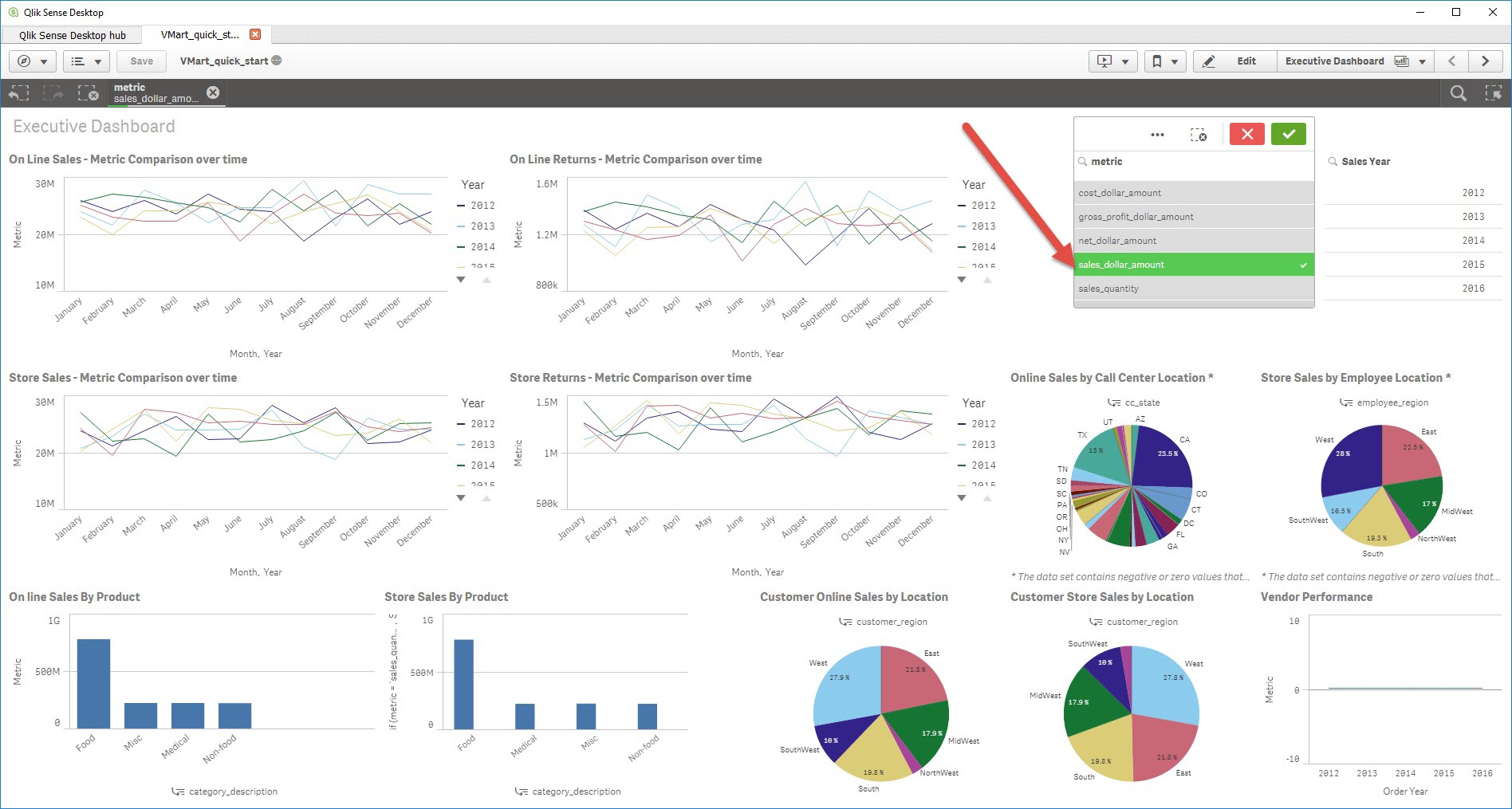
What makes these examples truly shine is interactivity. You don’t just look at a static chart—you click, filter, and slice. Select a product category, and the entire dashboard changes its tune. It’s like having a conversation with your data, except your data doesn’t interrupt you with bad jokes.
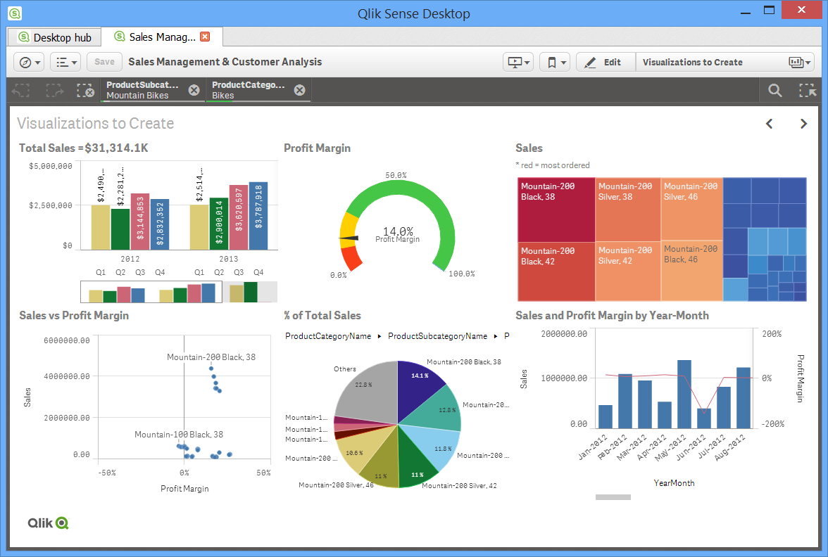
And don’t get me started on set expressions. They sound scary, but they’re just fancy math that says, “Show me last year’s numbers, but ignore the month my boss was on vacation.” Powerful stuff.
Wrapping Up: Your Data, But Cuter
Here’s the thing—you don’t need to be a data scientist to build these Qlik Sense sales dashboards. You need a bit of curiosity, a willingness to drag some blocks around, and the patience to fix one (just one) broken dimension. That’s it.
So go ahead. Open Qlik Sense, drop in your sales data, and make a dashboard that even your finance team will smile at. And if you make a mistake? Don’t stress. The undo button is right there, and it has never judged anyone. Not once.
Remember: every great sales rep started with a messy spreadsheet, and every great dashboard started with a “let me just try this” click. You’ve got this. Now go make those numbers dance—and try not to hurt your back while you’re at it. You’re a data hero in the making, and that’s something to smile about.