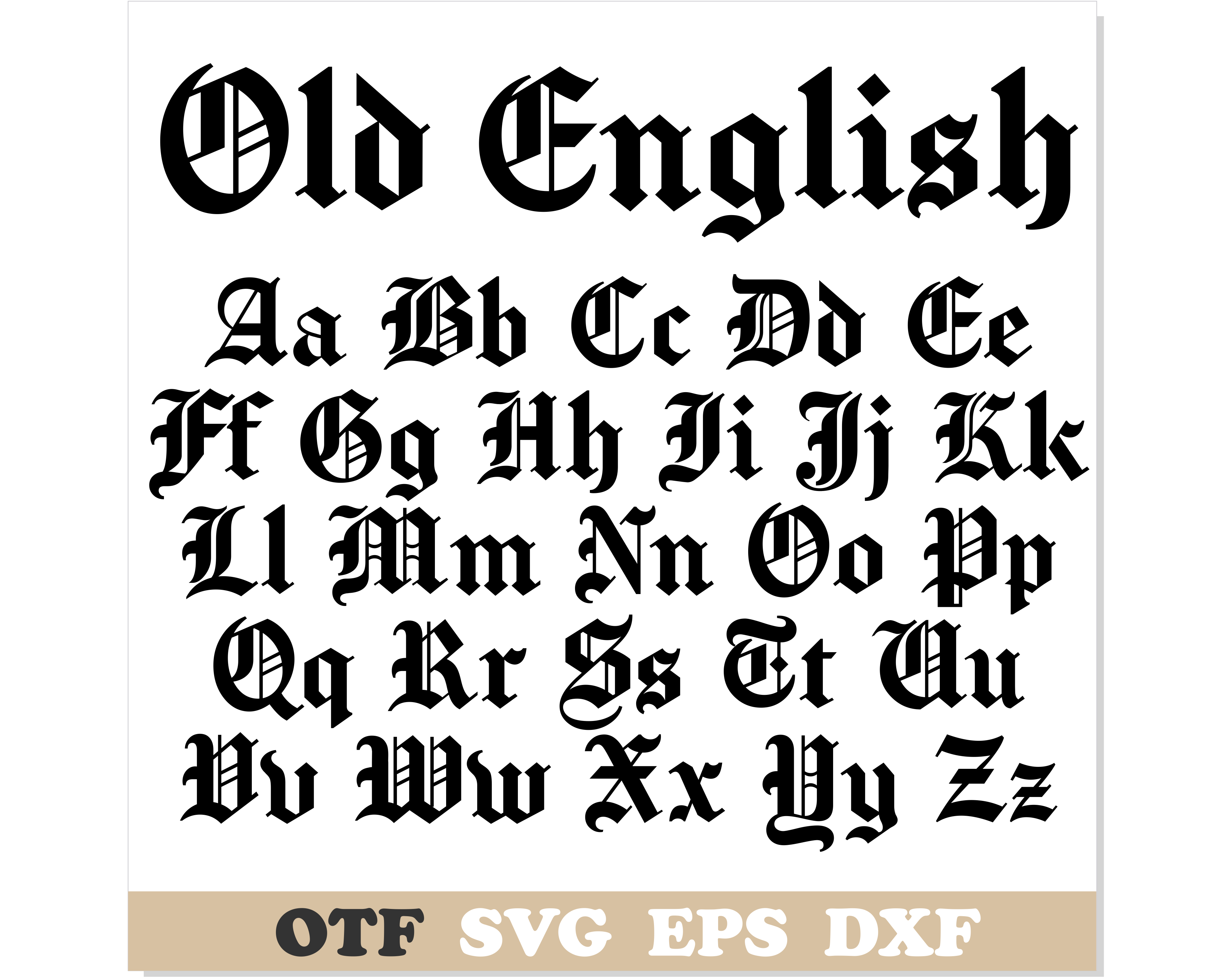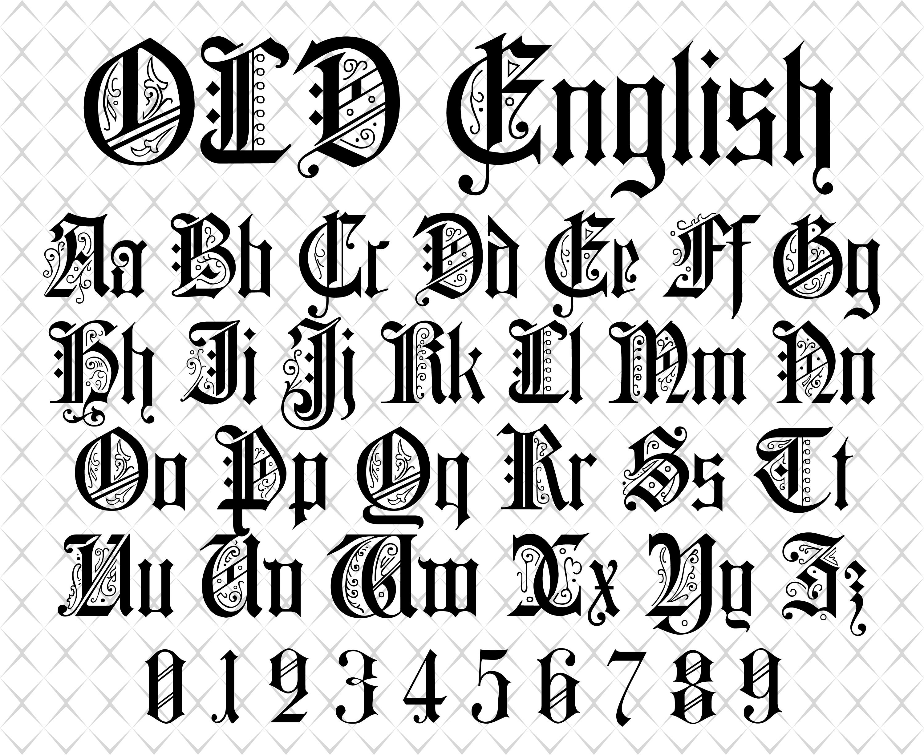
Old English Font Adobe Illustrator

Okay, let’s talk about something that sounds intimidating but is actually super fun: Old English fonts in Adobe Illustrator. You know the vibe—that super dramatic, medieval, “I’m about to get my sword engraved” look. It’s everywhere, from beer logos to your cousin’s tattoo.
But trying to actually use one in Illustrator can feel like deciphering a ancient scroll, right? I’ve been there, staring at a text box, wondering why my letters look like a shattered mirror. Don’t worry, we’re going to fix that together, right now, over this imaginary coffee.
Why Does Illustrator Hate Me (and My Font)?
First, let’s get one thing straight: Illustrator doesn’t hate you. It just has a weird taste in fonts. When you type with a regular font, it’s smooth, but Old English is all about sharp angles and crazy thin-thick contrast.
Must Read
The problem is that standard text tools often simplify these details. That’s why your letters might look like flat, boring blobs instead of the epic, jagged masterpieces they should be. The fix? You need to treat the font like a shape, not just text.
Think of it like this: you bought a cool car, but it’s stuck in first gear. We’re going to pop the hood and give it some gas.
Step One: The “Create Outlines” Magic Trick
This is the big one, folks. Highlight your text, go to Type in the top menu, and click Create Outlines. Boom. Your text just became a bunch of vector paths.
It’s like turning a word into a sticker. You can now pull on those little anchor points, twist them, and stretch them without any font rules getting in your way. This is where the real fun starts, trust me.
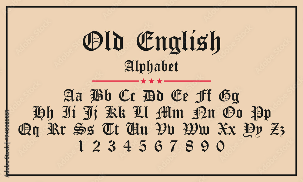
Suddenly, that “A” isn’t just a letter; it’s a piece of art. You can move individual spikes, widen the gaps, or make the whole thing look absolutely unhinged. It’s powerful stuff.
Step Two: Befriend the “Direct Selection Tool”
Here’s where we get cozy. That white arrow in the toolbar, the Direct Selection Tool (A key), is your new best friend. Click on your outlined text, and you’ll see a million tiny squares appear.
Those are your anchor points. Click one, and you can move it. Drag a little handle, and you can curve the line. It feels like digital sculpting, but for letters. Seriously, you can spend an afternoon just fidgeting with a single “S.”
Don’t be shy. Pull a corner off your “R” and make it look extra feisty. There are no rules here, it’s your typography playground.

Getting the Right Font (Because That’s Half the Battle)
Okay, so you have the tools, but what if the font itself is terrible? Not all Old English fonts are created equal, folks. Some are super clean; others are so ornate they look like barbed wire.
For a project that won’t give you a headache, look for fonts with clear, bold strokes. Names like “Cloister Black” or “Old English Text MT” are classics, but they can be thin. Try something like “Medieval Sharp” or “Lordish” for a chunkier vibe.
And for the love of all that is holy, avoid fonts that look like they were scanned from a napkin. You want clean curves, even if they’re spiky. Check the preview in your font menu, or just type a few random letters like “AaBbXx” to see the rough stuff.
Quick Tip: Play with Stroke and Fill
Now that it’s a shape, you can do crazy things. You can give it a thick black fill and a bright yellow stroke. It looks like a street sign from hell, and it’s fantastic.

Or, try removing the fill entirely and just keeping the stroke. That gives you a cool, wireframe, blueprint look. It’s perfect for a conspiracy-theory poster or an indie band's album art. Your call.
You can even add a gradient to it. Imagine a blue-to-purple fade on those sharp letters. It’s like a wizard wrote it, and I mean that in the best possible way.
The Overlap Trick for Instant Edge
Here’s a secret move: type two words, outline them, and then overlap them. Like, put one word right on top of the other. Then, select both and hit Pathfinder > Unite.
That combines everything into one solid shape, cutting out the overlapping bits. It creates this dense, interlocking, impossibly cool clump of text. It’s the visual equivalent of a battle cry.
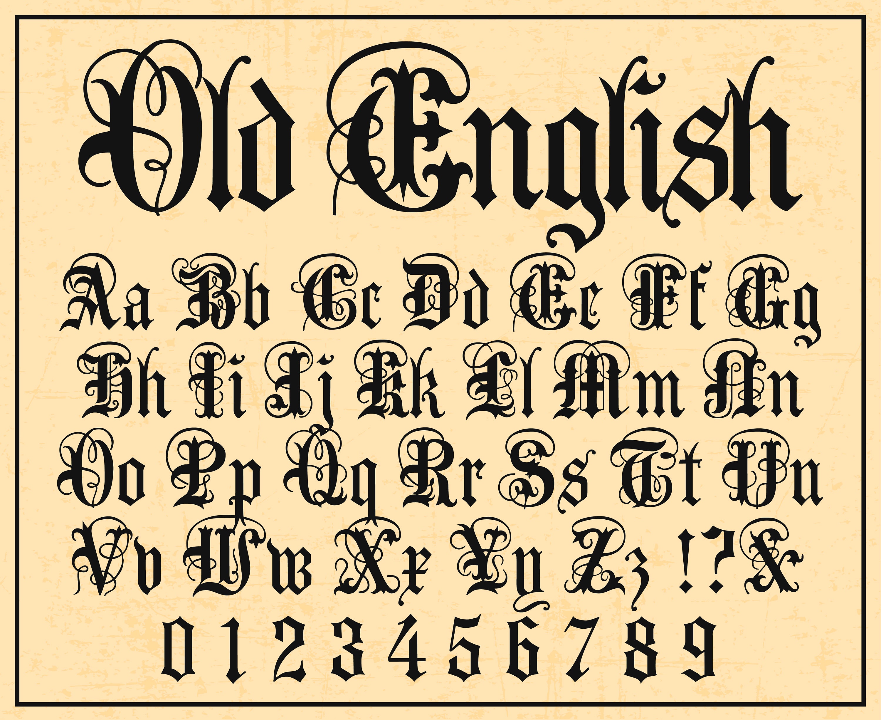
It’s a bit messy, but messy is good. It looks like a logo for a metal band that only plays songs about dragons. You’re welcome.
Don’t Forget the “Make a Mesh” Panic Button
If you’re feeling extra lazy (or brilliant), there’s a shortcut. Type your text, keep it as text, and go to Object > Envelope Distort > Make with Mesh. Set it to like 3 rows and 3 columns.
Now you can move the grid lines to warp the letters into a wavy, dripping, or bloated shape. It’s like typing on a water balloon. It’s not precise, but it’s fun.
Use this for a quick “grunge” effect or when you just want to smash the letters a little bit. No one will know you took the easy way out. It’ll be our secret.
So, next time you open Illustrator and that Old English font looks blah, remember this chat. Outline it, poke at it, and give it some personality. You’re not just typing; you’re forging letters, one anchor point at a time. Now go make something gloriously medieval.