Office 365 Data Analysis Toolpak
Your Spreadsheet Just Got a Brain (and It’s About Time)
Let’s be honest: Excel is the digital equivalent of that friend who’s always reliable but never really fun at parties. You can list your grocery budget, track your dog’s weight, or pretend to understand your boss’s quarterly projections. But when you need real answers—like “why is my coffee spending up 20%?”—Excel just shrugs at you.
That’s where the Office 365 Data Analysis Toolpak waltzes in. It’s like giving that reliable friend a shot of espresso and a leather jacket. Suddenly, your boring rows of numbers start talking back, and—surprise—they have some hilarious things to say.
What in the World Is This Toolpak?
Think of it as your personal data detective, but without the trench coat or the dramatic slow-motion walk. You click a few buttons, and it runs those heavy-duty statistical tests you’ve been avoiding since college. You know, the ones that made you sweat in a windowless classroom while someone droned about standard deviations.
Must Read
Here’s the kicker: it’s been hiding right inside your Office 365, like a secret menu item at a fast-food joint. You just have to enable it once, and boom—you’re officially a “data wizard” at your next team meeting. Nobody has to know that you still can’t pronounce heteroscedasticity.
Why You’ll Love It (Even If You Hate Math)
Last month, I used the Toolpak to figure out why my side hustle (selling handmade birdhouses) dipped in sales every time I posted a video of my cat. The Toolpak ran a quick regression and produced a chart that basically yelled, “Your cat is a sales killer, Karen.” That’s the kind of brutal, helpful honesty you want at 11 PM on a Tuesday.
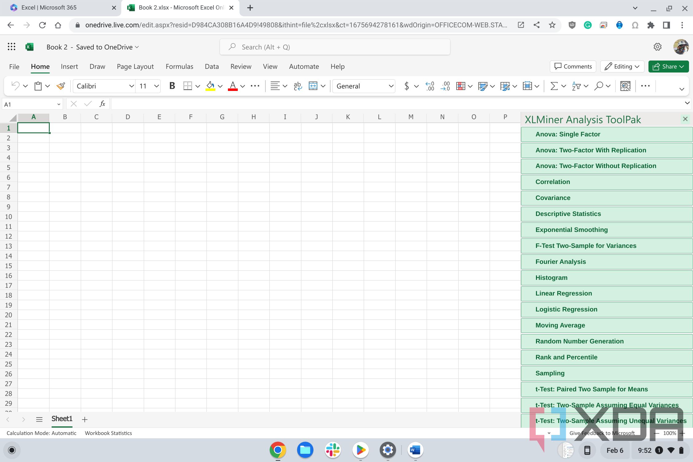
It also does descriptive statistics—which is just a fancy way of saying “tell me the average, the spread, and whether my data is as messy as my desk.” You get a neat table that says your average weekly spending on takeout is $87. You’ll laugh, then cry, then immediately write a passive-aggressive email to your family about grocery planning.
But Wait, There’s More—and It’s Actually Fun
You get tools for histograms, moving averages, and exponential smoothing. Don’t let the names scare you. The histogram is just a bar chart that shows your data’s “mood swings”—like how many days you felt okay vs. how many days you wanted to hide under a blanket. The moving average is perfect for tracking your mood swings over time, so you can predict that you’ll crash every third Wednesday. Self-awareness has never been so spreadsheet-driven.
I once used the sampling tool to randomly pick which of my plants to water first. Did it save time? No. Did it make me feel like a mad scientist? Absolutely. That’s the secret—this thing turns mundane chores into a mini science fair in your living room.
How to Get It Without Feeling Like a Tech Novice
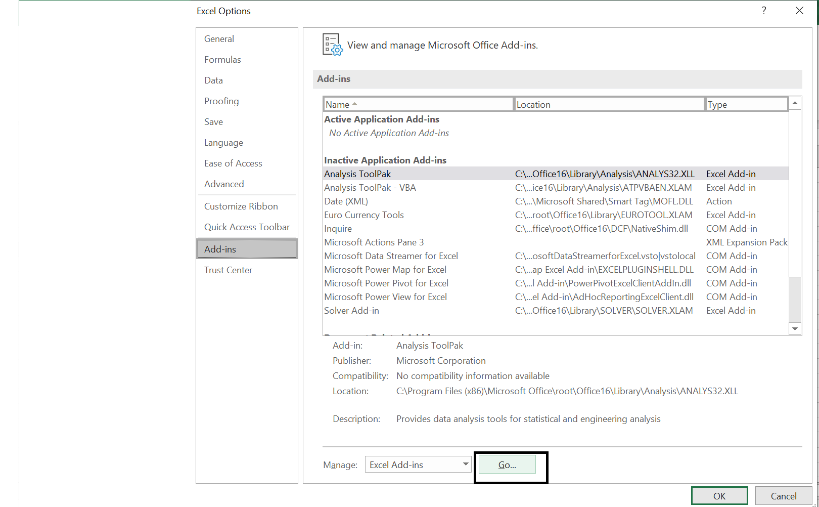
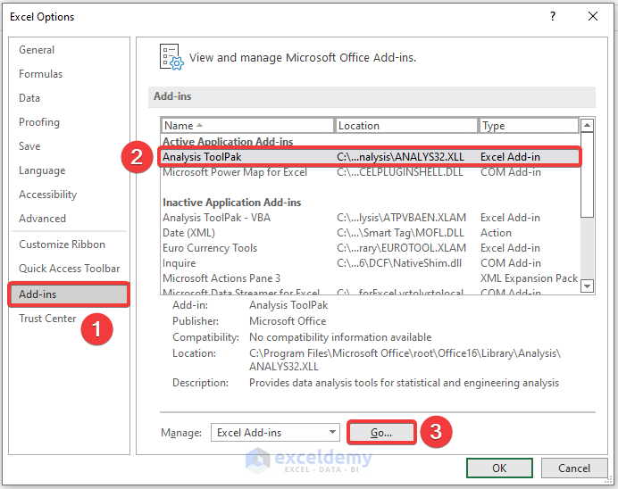
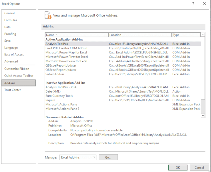
First, open Excel. Go to File → Options → Add-ins. Scroll down to “Excel Add-ins” and click Go. Then check the box next to “Analysis ToolPak” and hit OK. If you follow these steps and fail, just blame it on “company policy” or “IT being useless.” We’ve all been there.
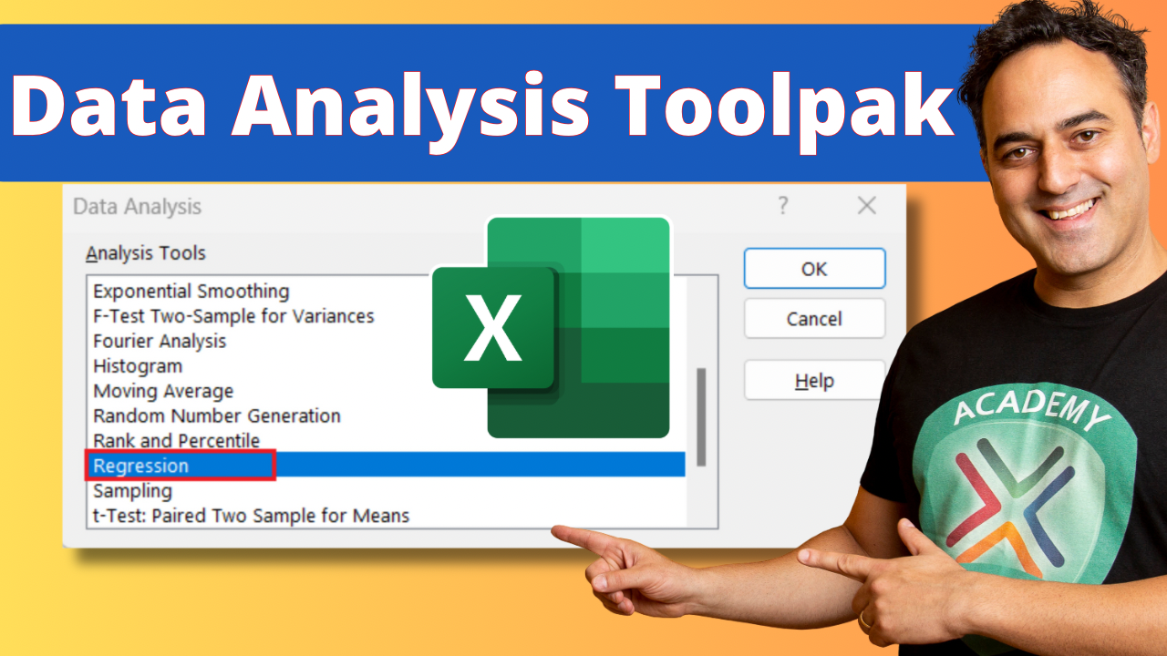
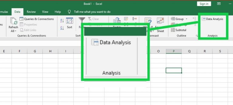
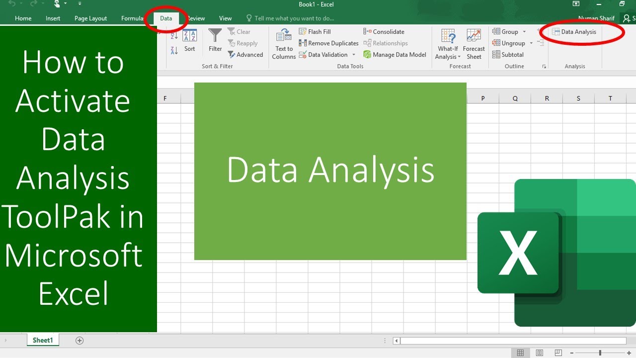
Now, when you need to run an analysis, you’ll find “Data Analysis” under the Data tab, all the way to the right. It sits there, blinking at you like a friendly robot who wants to help but also judges your life choices. Click it, choose a tool, and watch the magic happen.
Real-Life Moments Where You’ll Nod and Smile
Picture this: You’re trying to convince your partner that you should order pizza three nights a week. You run a quick t-test comparing weeknight family happiness between pizza nights and salad nights. The output says the difference is statistically significant—pizza wins by a landslide. You print that sucker and tape it to the fridge. Domestic victory, secured with p-value of 0.03.
Or, you’re tracking your gym visits and suddenly notice a “correlation” between the days you wear your lucky socks and the days you actually finish a workout. The Toolpak will happily report a positive coefficient of 0.8. You’ll never train without those socks again. That’s not science; that’s personal mythology with a side of regression output.
So go ahead, enable the Toolpak. You’ll impress your coworkers, annoy your family with “evidence-based” dinner arguments, and finally understand why your life feels like a scatterplot with no trend line. And if you still don’t get it? Just smile, nod, and say, “The data doesn’t lie.” Because it doesn’t—but it definitely has a sense of humor.