
How Do You Make A Logo Transparent
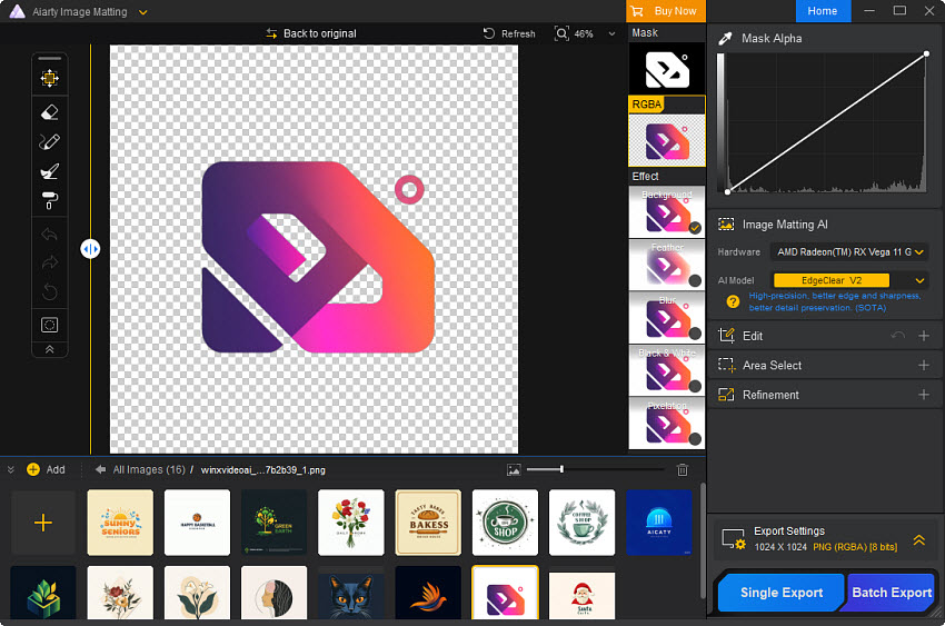
It started, as all great internet dilemmas do, with a client sending a PDF that looked like a ransom note made of white boxes. You know the drill: you’re mid-victory-lap on a project, and then you see it—a hideous, opaque square squatting on a pastel background where your sleek vector logo should be. Suddenly, your carefully curated brand identity looks like a postage stamp on a wedding invitation. This is the moment the ‘transparent logo’ discourse went from a niche Photoshop question to a full-blown TikTok subculture, complete with passive-aggressive comment sections and grainy screen recordings. We are, officially, in the era of the crisp edge, where alpha channels rule supreme and the dreaded “white fill” is the fashion faux pas of the digital age.
Why is everyone suddenly losing their minds over pixels you can’t see? Because the economy of influence runs on aesthetics. From drop-shipped merch to Substack newsletters, the ability to slap a logo on anything—a mug, a podcast cover, a grainy YouTube thumbnail—is the new literacy. And nothing kills the vibe faster than a logo that looks like a bathroom tile. We’ve moved past the debate of whether Comic Sans is a crime; the current uncanny valley is a visible bounding box. The internet has collectively decided that if your logo isn’t transparent, you aren’t just failing at design—you’re failing at vibe curation.
But here’s the kicker: the cultural obsession has outpaced the technical know-how. We’ve got an entire generation of hustle-culture entrepreneurs who can edit a Reel in 15 seconds but freeze up when asked to remove a background. So let’s cut through the noise, drop the jargon, and get your PNGs looking like ghosts—in the best possible way. This isn’t about becoming a pixel-perfect designer; it’s about survival in a feed that punishes white rectangles.
Must Read
The Toxic Subculture of the Opaque File
Let’s be real: the ‘transparent logo’ community is a weird, stratified hellscape. On one side, you have the purist vector elitists—the ones who live in Adobe Illustrator and scream “AI files or GTFO” at anyone who mentions “saving as JPG.” They hover on Reddit boards like r/DesignPorn, ready to dissect a quarter-inch of un-anti-aliased edge. For them, transparency isn’t a tool; it’s a sacred doctrine. They treat a JPEG with a white background like a war crime, posting “restorations” of logos with dramatic orchestral music in the background. It’s exhausting, but they’re partially right—if you start with a raster file, you’re already losing the battle.
Then there are the chaos agents: the Canva warriors and the background-remover app devotees. These are the people who discover a magic wand button and immediately apply it to a logo with intricate drop shadows or, worse, a gradient that melts into a white haze. The result? A mangled halo of gray pixels that looks like the logo survived a house fire. The comment sections on TikTok videos about this are brutal—top comments range from “girl that’s not transparency, that’s just blur” to “use remove.bg and pray.” It’s a class war between those who understand DPI and those who just want to post a motivational quote over a picture of a sunset. The cultural shift is clear: we are all grading each other on the cleanliness of our negative space, and the scrutiny is hotter than a GPU at 4K rendering.
![How to Make a Logo Transparent in 4 Ways [Step by Step] | XPPen](https://www.xp-pen.com/Uploads/blog/2024/01/how-to-make-logo-transparent.jpg)
How to Get a Transparent Logo Without Losing Your Sanity (Or Your Wallet)
First, let’s shatter the myth that you need a $60/month Adobe subscription to achieve nirvana. You don’t. But you do need to understand the one rule that separates the pros from the posers: transparency is not a filter you apply; it’s a property of the file itself. If you are starting from scratch, design in a vector-based program. If you don’t have one, beg, borrow, or steal a friend’s Figma account. The beauty of vectors is that they are math, not pixels—they have no background unless you explicitly paint one. When you export, choose PNG (for screens) or SVG (for the web), and ensure the “Transparent Background” checkbox is ticked. This is step one, and it’s non-negotiable.
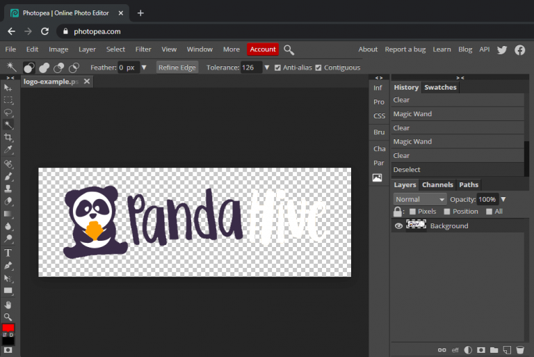
Now, for the 90% of you who have a legacy logo trapped in a JPG hellscape, we need to perform digital surgery. Your first instinct might be to use the “Magic Wand” in Photoshop or the eraser tool. Stop. That’s how you get jagged edges that scream “I made this in 2008.” Instead, pivot to the ‘Remove Background’ feature in PowerPoint (yes, you read that right—PowerPoint has a surprisingly decent one for simple logos) or the dedicated AI tools like remove.bg. These tools work beautifully if your logo has solid, high-contrast colors. But here’s the pro-tip: if your logo has a thin white stroke or a shadow, the AI will often eat it or leave a ghostly haze. You’ll need to manually clean the edges using a layer mask—a skill that takes 10 minutes to learn on YouTube and will save you from 10 years of aesthetic shame.

Let’s talk about the elephant in the room: PNG-24 vs. PNG-8. If you’re a control freak, this is your moment. PNG-24 supports millions of colors and full alpha transparency—use this for logos with gradients or soft shadows. PNG-8 is a compressed format with limited colors, but it’s perfect for simple, flat logos with crisp edges; it keeps file sizes small, which is crucial if you’re sending this to a web developer who hates you. Ignore anyone who tells you to use a GIF for logos—unless you want your logo to look like a relic from a GeoCities fan page. The goal is a crisp edge, but you must also manage your expectations: a logo that is 50% black on a white background will never look perfect as a transparent PNG if you didn’t bake the transparency in at the source. If the design relies on the white to create contrast, you’re going to have a bad time.
Finally, let’s address the dark art of double-checking your work. Before you send your precious transparent file to a client or upload it to your merch store, do the “Dark Mode Test.” Put your logo on a black background. Then put it on a checkerboard pattern (the classic sign of transparency). If you see white specks, jagged gray fuzz, or a faint box, you’ve failed. Fix it by zooming in 400% and manually erasing the debris. This takes patience, but it’s the difference between looking like a professional studio and looking like you run a dropshipping business from a dorm room. Remember: the goal isn’t just to make the background invisible; it’s to make it feel like the logo was born on that surface, not pasted onto it.

The Burning Questions the Internet Can’t Stop Arguing About
Is it better to have a vector file or a high-res PNG?
The internet will scream at you until the end of time about this. The definitive, pragmatic answer is: it depends on your end goal. A vector file (SVG, AI, EPS) is a mathematical blueprint. It can be scaled to the size of a billboard or a postage stamp without losing a single iota of sharpness. If you’re working with printers, sign makers, or any serious branding professional, they will demand a vector file—they see a PNG as a clay sculpture, not the marble statue. However, for 99% of your daily life—social media, digital ads, email signatures—a high-resolution PNG (at least 1000px wide) is perfectly fine. The real trap is creating a tiny 100px logo and trying to stretch it; that’s when transparency becomes a smudgy smear. The cultural divide here is about control: vectors give you infinite control, while rasters give you convenience. Don’t let the elitists bully you into the vector fold if you’re just posting on Instagram, but if you’re going to present this to a boardroom, you better have an SVG backup.
Why does my logo have a white border even when I save it as a transparent PNG?
Ah, the classic “ghost edge” phenomenon. This happens because of a design flaw in the original logo—usually, the logo was designed with a white stroke or a soft drop shadow that relies on white to create depth. When you remove the background, you’re actually removing the canvas, but those white stroke pixels remain, creating a halo. Another culprit is anti-aliasing—the pixels at the edge blend with the white background, so when you take the background away, they retain a slight white tint. The fix is not to use the magic eraser but to use a matting technique in Photoshop or an editing app. Go to Layer > Matting > Defringe, and set it to 1-2 pixels. This shifts the edge pixels to match the logo’s main color, not the background. If that doesn’t fix it, you’ll have to manually redraw the problematic edge. It’s tedious, but it’s the difference between a clean cut and a papercut. The internet often suggests “just export it again,” but that will do nothing if the core file is contaminated. You have to fix the source, not the symptom.
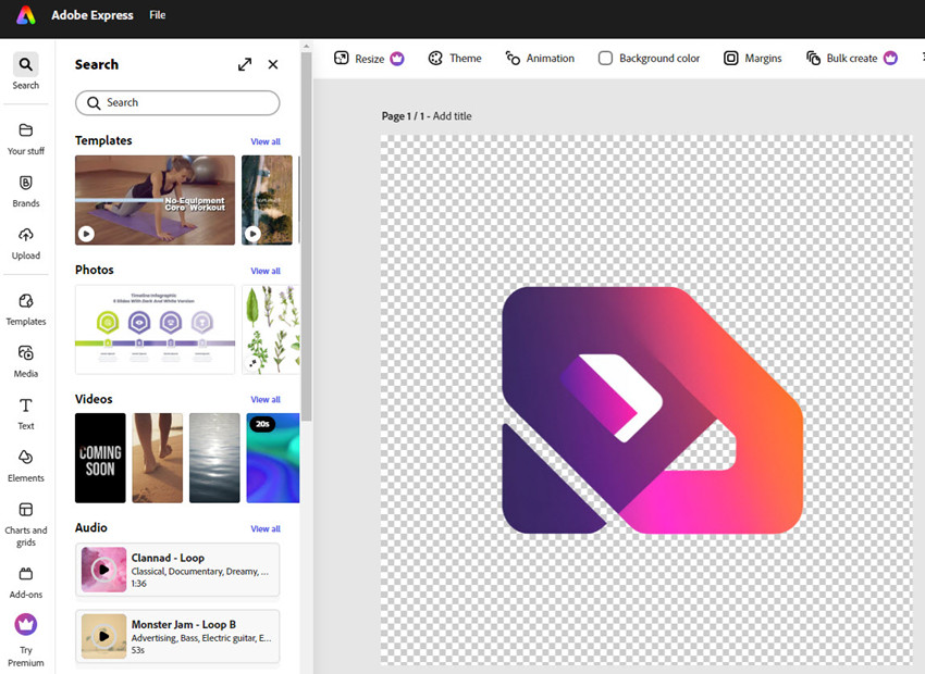
Can I just use a background remover app on my phone?
Yes, you can—and you will likely regret it. Apps like Background Eraser or even the iOS 16+ “lift subject” feature are incredible for everyday objects, but they are terrible for logos with intricate details, thin lines, or overlapping elements. They often punch holes in your letterforms or leave jagged, zombie-like edges. The current viral trend on TikTok is people showing their “clients” a phone-edited transparent logo, and the client noticing that the “O” in their company name has a chunk missing. It’s a whole genre of cringe. If you absolutely must use a phone app, one that uses AI semantic segmentation (like remove.bg’s mobile version) works better, but you still need to zoom in and manually refine. The real issue is file management: phone apps often export in lower DPI, which is fine for a story but useless for print. So, unless you enjoy public embarrassment, treat the phone app as a Stopgap, not a Solution. Your logo deserves better than a hack job done in the back of an Uber.
So, is the transparent logo a fleeting trend, or a fundamental shift in how we view branding? I’d argue it’s the latter, but for a reason that’s less about tech and more about psychology. In a world of infinite feeds, the ability to adapt—to blend in or stand out—is a survival trait. A logo that sits on a white box feels rigid, old-fashioned, and unimaginative. A transparent logo feels alive, like it belongs to the dynamic, ever-shifting ecosystem of the web. It signals that you understand the medium, that you’re fluid, that you can exist anywhere from a dark mode app to a neon sign. The permanence isn’t about the file format; it’s about the mindset of flexibility.
However, we must guard against the fetishization of transparency for its own sake. Just because a logo is transparent doesn’t mean it’s good design. You can have a transparent logo that is still ugly, illegible, and off-brand. The trend has given us tools, but with great power comes great responsibility—and also a lot of over-designed nonsense floating around the web. The real takeaway is this: mastery of the invisible is the ultimate flex. It’s not about showing off your technical wizardry; it’s about making your content seamless enough that no one even notices the mechanics. So go forth, clean up your edges, and remember—if you can’t see the background, you’re already winning.
![[Tutorial] How to Make a Logo Transparent in 4 Steps](https://www.designevo.com/images/blog/how-to-make-a-logo-transparent/how-to-make-a-logo-transparent-4.png)
