Andrews Pitchfork Trading Strategies
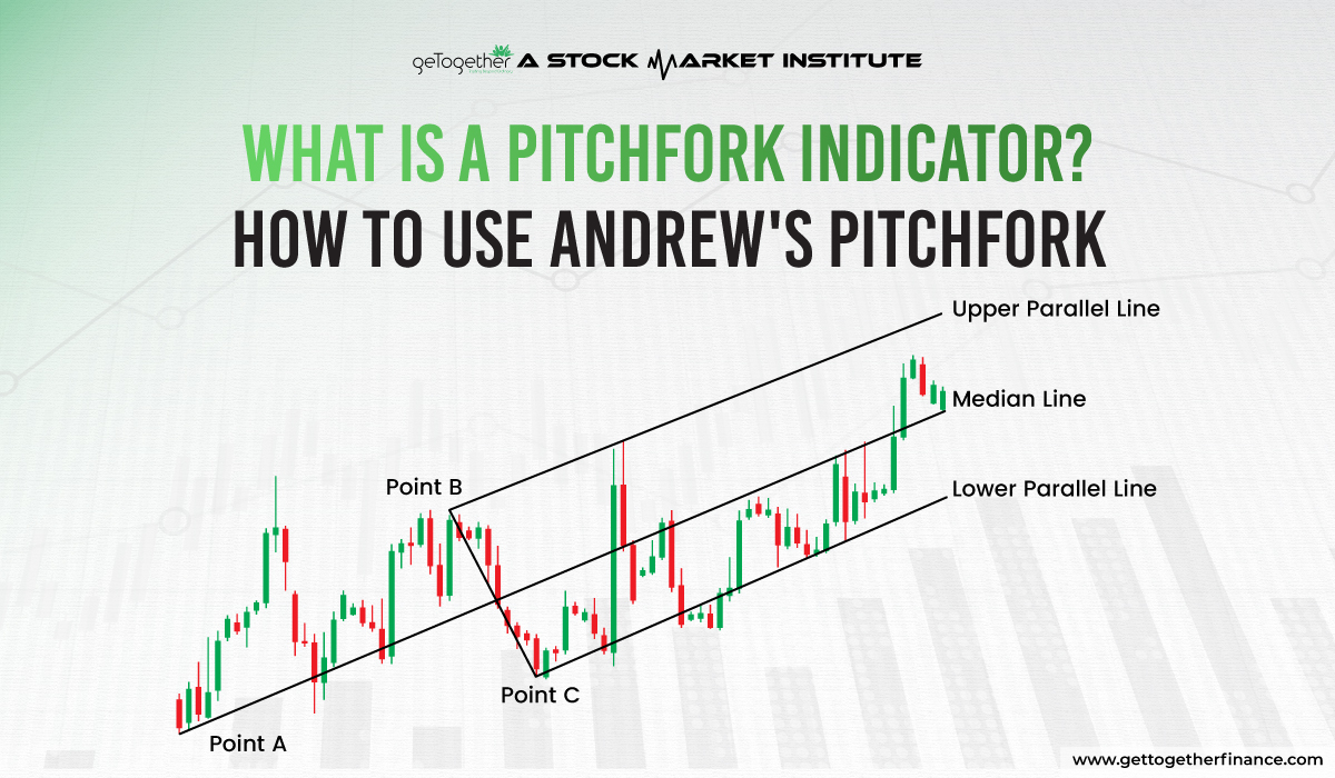
Imagine a tool so elegantly simple that it feels less like a technical indicator and more like a philosophical statement about market geometry. That is the Andrews Pitchfork, a creation of the late Alan Andrews, a self-taught trader who believed that markets do not move in straight lines but in rhythmic, parallel channels that reflect the collective psychology of bulls and bears. Born in the 1960s and popularized in the 1970s, the Pitchfork is essentially three parallel trendlines drawn from three significant pivot points, creating a visual "fork" that traders use to predict support and resistance. In an era dominated by AI-powered algorithms and neural networks, the Pitchfork remains a stubbornly analog, yet shockingly effective, relic of technical analysis—a reminder that human behavior, with all its fear and greed, hasn't changed one bit since Andrews first sketched his lines on a chart.
Why does this matter today? Because amidst the cacophony of stochastic oscillators and volume-weighted average prices, the Pitchfork offers a silent, structural narrative. It doesn't tell you what to buy; it tells you where the market is likely to breathe. In a world where we’re constantly chasing the next cryptic tweet or geopolitical headline, the Pitchfork anchors us to the idea that price movement is a story with a beginning, a middle, and an end. For the modern trader—whether you’re flipping memecoins or managing a pension fund—this tool offers a kind of zen-like clarity: it forces you to look at the shape of the market, not just the noise. It’s the trading equivalent of reading a novel backwards to see how the plot was structured all along.
The Dark Art of Drawing Lines: Psychology, Myth, and the "Third Line"
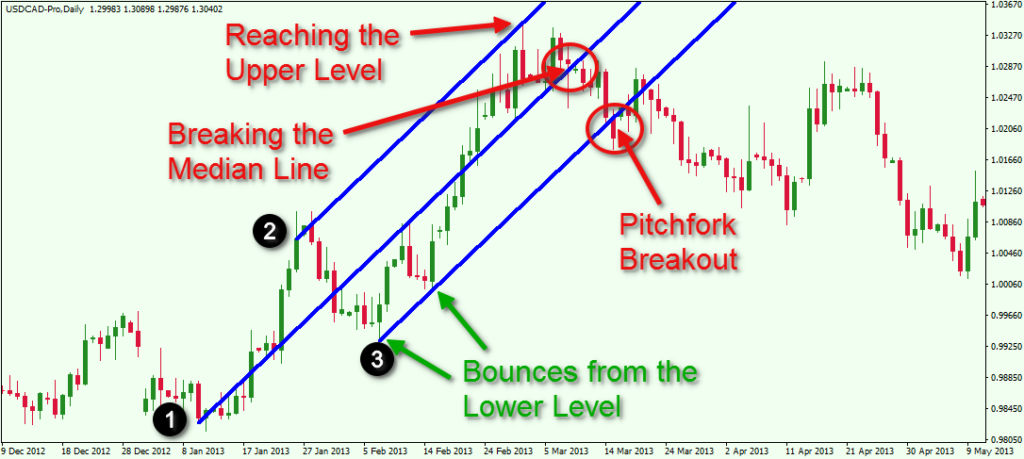
Here’s where the Pitchfork gets delightfully weird. Most traders know the basic setup: you anchor the handle at a major swing low (for an uptrend) and extend the tines through the subsequent two pivot highs. But the lesser-known secret is that Andrews himself was obsessed with the median line—the central tine—calling it the "median line of magnetic attraction." He believed that price, like a pendulum, would oscillate around this central line, and that a touch of the median line was often a more powerful signal than the outer tines. This isn't just technical jargon; it’s a psychological mirror. The median line represents the "norm," the consensus of the trading crowd. When price violently rejects the median line, it’s the market having a panic attack, overreacting to information that wasn't priced in. When price holds it like a lifeline, it’s the calm confidence of a trend that has become self-aware.
Must Read
The cultural impact of the Pitchfork is strangely counter-culture. In a quant-driven world where formulas have replaced intuition, the Pitchfork feels like a secret handshake among a small tribe of chartists. It’s the tool of the "lone wolf" trader, the person who finds comfort in hand-drawn lines on a cracked monitor rather than a Bloomberg terminal. There's a dark irony here: the Pitchfork is notoriously subjective. Choose a slightly different pivot point, and your fork skews dramatically, leading to wildly different predictions. This ambiguity is exactly why it works. It forces you to commit to a narrative. In a psychological sense, drawing an Andrews Pitchfork is a declaration of intent. You are saying, "This is where I believe the market is heading, and I will accept the consequences." That act of commitment, backed by the visual scaffolding of the lines, creates a self-fulfilling prophecy—enough traders draw the same fork, and the market bends to their will.
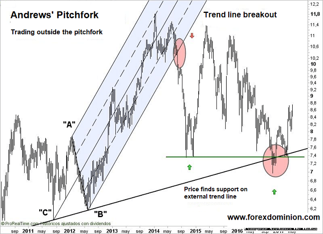
But the most fascinating—and dark—fun fact is the "warning tine" phenomenon. Andrews discovered that when price breaks and closes beyond the outer tine, the subsequent move is usually violent, often doubling or tripling in speed. This is the "black swan" moment of the Pitchfork. It’s the market's collective breakdown, where the orderly channels of supply and demand dissolve into pure, unadulterated chaos. The tine doesn't break because of a bad earnings report; it breaks because a critical mass of human participants loses their nerve simultaneously. It’s the technical analysis equivalent of a scream in a crowded theater. Understanding this—that the Pitchfork’s boundaries are not walls but psychological thresholds—separates the novice from the master. The novice sees a line to buy at; the master sees a line that, once breached, signals a temporary psychosis that demands respect, not risk.
Practical Scenarios: From the 2020 Crash to Your Daily Coffee Chart
Let’s put the Pitchfork to work with a concrete scenario that would terrify any beginner. Imagine it’s March 2020. The pandemic has just crushed global markets. On the S&P 500, you identify a dramatic swing low at 2191 on March 23rd. You draw your fork from that low, extending the tines through the prior swing highs from early March. The result? The median line lands precisely around 2800, which becomes a magnet for price over the next four weeks. As price rallies, it kisses the median line three times, each touch a lower-high, before finally breaking through the upper tine in May. The takeaway isn't just "buy the median line"—it’s that the fork gave you a map for the rehabilitation of a shattered market. You didn't need to guess the bottom; you needed to respect the structure. The most practical takeaway for any trader is to wait for a close outside the tine before abandoning your thesis. A wick through the line is just a test; a close beyond it is a defection.

Here’s a second scenario, this time for the intraday trader using 5-minute charts on a stock like Tesla or NVIDIA. The key is the "pitchfork flip." If price is in a strong uptrend, you draw your fork from the lowest low. But when price starts consolidating, a common mistake is to redraw the entire fork. Instead, the pro move is to flip the anchor. You take that same consolidation and draw a secondary, smaller fork within the larger one. This creates a fractal-like structure—a fork within a fork. The outer tines of the big fork act as the "traffic lights," while the inner fork’s median line acts as the "turn signal." In a live session, this gives you pinpoint entry zones. If price touches the inner median line and bounces, you know the larger uptrend is intact. If it slices through the inner fork and lands on the outer tine of the big fork, you’re looking at a trend exhaustion. This layered approach isn't just analysis; it’s a tactical battle plan. It turns a chaotic intraday tape into a series of clear, actionable checkpoints.
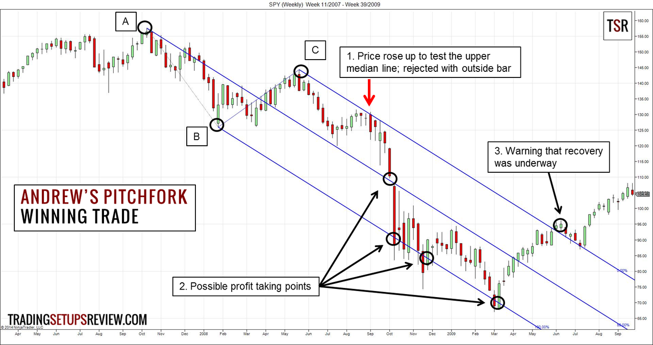
Now, let’s get practical about the psychological discipline. The most common reason the Pitchfork fails is impatience. Traders draw a fork, and then when price approaches the median line, they expect an immediate reaction. But markets, like people, are rarely punctual. Andrews used to say that price could "loiter" around the median line for days, violating the comfort zone of every short-term trader. The actionable takeaway here is to use the fork as a timing filter, not a binary predictor. If price has been in a strong rally and is now approaching the upper tine, don't short immediately. Instead, watch for a divergence on the RSI or a sudden increase in volume. The Pitchfork tells you where the danger is; the confirmation signals tell you when to act. This separates the gambler from the sniper.
Finally, here’s a case study in failure that teaches more than a hundred wins: the Bitcoin bull run of 2021. Many analysts drew a beautiful pitchfork from the bottom of March 2020, and the fork held perfectly for months. But in November 2021, Bitcoin broke below the lower tine on massive volume. Traders who insisted on buying the "support" of the lower tine were obliterated as price fell 70%. The lesson? The Pitchfork is not a promise; it is a probability. When the underlying narrative of the market changes—when institutional sentiment shifts from "digital gold" to "risk-off"—the geometric framework becomes irrelevant. The dark truth is that the Pitchfork is a tool for trending environments, not for regime changes. The practical takeaway is to always align your fork with the higher-timeframe trend. If the weekly chart is bullish, use the pitchfork on the daily chart only to find pullback entries. If the weekly chart is bearish, don’t use the pitchfork to catch falling knives; use it to identify shorting zones near the median line. Context is king, and the Pitchfork is merely a loyal courtier.
Frequently Asked Questions: The Unvarnished Truth
1. Is the Andrews Pitchfork a leading or lagging indicator?
It’s a transitional beast. Unlike a moving average, which is purely lagging (it only tells you what has happened), the Pitchfork is retroactive in its structure but proactive in its interpretation. You are drawing lines based on historical pivots, so in that sense, it’s late to the party. However, the projection of the lines forward into the future gives it a leading quality. You are anticipating specific price levels where reactions are statistically more likely. The key is to understand that it’s not predicting the future; it’s predicting the reaction to the future. It’s a volatility compression tool. Think of it as a weather map showing where a storm is likely to form, not a radar showing the rain that’s already falling. The best traders use it to prepare, not to predict.
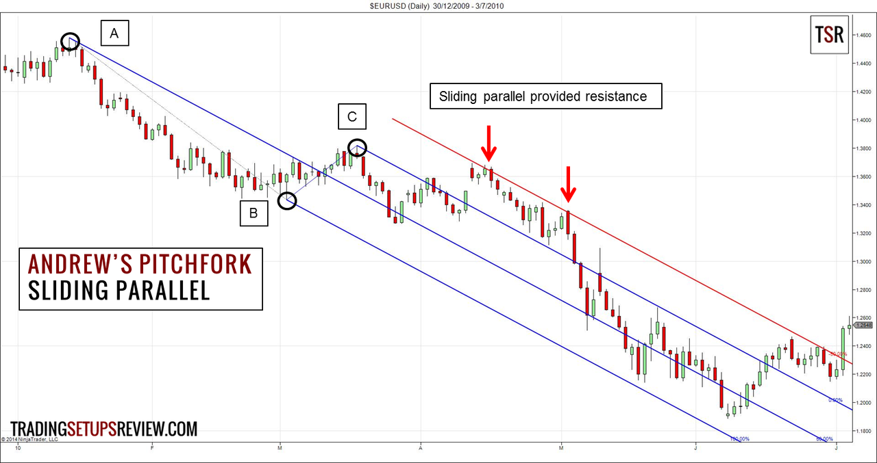
In practice, this means you should never enter a trade just because price is at the median line. Instead, you should wait for a candle to close, showing a rejection wick. That is the leading signal generated by the pitchfork’s line. The line itself is just a stage; the performance begins when price interacts with the stage. So, to answer directly: it is a hybrid. The drawing is lagging, the levels are leading, and the confirmation is entirely your responsibility. This is why it fails for people who treat it as an oracle. It’s a map, not a gps.
2. How do I choose the correct pivot points for the origin and the tines?
This is the million-dollar question, and it’s where most traders go mad. The golden rule is structural relevance. The origin should be the most obvious major swing high or low on the timeframe you are trading—the point where price reversed with force, not just a minor pullback. For the lower tine, you use the first major swing high after the origin (for an uptrend). For the upper tine, you use the second major swing high. The critical mistake is using two points that are too close together, creating a narrow, useless fork, or two points that are too far apart, creating a fan that’s too wide to be meaningful. A good heuristic is to look for pivots that are separated by a reasonable number of bars—typically 10 to 20 bars on that timeframe.
Another common technique to refine your choice is to use the "pivot close" method. Don't use the highest wick of a swing; use the closing price of the most significant reversal bar. This filters out intra-bar manipulation and gives you a cleaner, more consistent fork. If you draw a pitchfork and it immediately looks "wrong" or awkward, trust that feeling. Your subconscious is signaling that your pivot choices are not representative of the market’s true structure. In that case, delete it and re-draw. It’s better to spend an hour testing different pivots than to spend a week fighting a bad fork. Remember, the market doesn't care about your lines; it only reacts to the ones that reflect the majority's consensus.
3. What is the "median line" and why is it so important for trading psychology?
In Alan Andrews’ original teachings, the median line was the Holy Grail. He called it the "invitation to enter." The logic is that price often reverts to the mean before making its next impulsive move. When price pulls back to the median line, it’s like the market taking a deep breath, calibrating its strengths, and then launching forward. Psychologically, this is the point where the most indecision exists. Buyers are worried they’re catching a falling knife, and sellers are worried they’re shorting a rocket. This indecision manifests as lower volatility and tighter ranges. A wise trader watches for a bullish or bearish engulfing candle right at the median line—that’s the queue that the argument has been settled.

The median line is so important because it offers the best risk-to-reward ratio. Your stop loss can be placed just beyond the opposite side of the median line, which is a relatively tight distance, while your target is the upper tine, which is a much larger distance. This 1:3 or 1:4 ratio is what makes the strategy consistently profitable, even with a 50% win rate. But the psychological trap is that the median line can be crossed easily during high-volatility news events. The rule is to ignore the wicks and wait for the daily or 4-hour close. If price closes decisively below the median line, the fork is likely broken. If it closes above, the mean is reasserted. It’s a battle of the will, and the median line is the battlefield.
4. Can the Pitchfork be used in conjunction with other indicators, or is it a standalone system?
Using a pitchfork alone is like using a hammer for every home improvement task—it works, but you’re missing out on precision. The best practice is to combine it with a momentum or volatility indicator, but specifically to filter the pitchfork signals, not to generate new ones. Two excellent companions are the MACD and the Average True Range (ATR). When price touches the median line, you check the MACD histogram. If it’s beginning to contract or curl upward (in an uptrend), that confirms the rejection. If the MACD is expanding downward, it suggests the median line will easily be broken. Similarly, you can use ATR to gauge the "quality" of the touch. If the ATR is extremely low during a price touch, it means we are in a calm consolidation, and a breakout is imminent. If ATR is spiking, it means the market is frantic, and the pitchfork levels are less reliable.
Another powerful combo is with Fibonacci retracement levels. For example, if price pulls back to the median line, and that median line also coincides with the 61.8% Fibonacci retracement level of the last major swing, you have a confluence zone—an area of extremely high interest. This is where the pitchfork transcends from a simple drawing into a powerful prediction engine. However, the opposite is also true: if the pitchfork conflicts with a major Fibonacci level, it’s often a sign of high instability. In that case, the smart move is to stay out. The pitchfork should be the framework, but other indicators are the exclamation points. Don't let the fork dictate your entire decision tree; let it provide the high-probability zones that you then validate with other evidence.
5. What is the "schiff pitchfork" and how does it differ from the traditional one?
The Schiff Pitchfork is a modification created by Jerome Schiff, a former student of Andrews. The traditional method assumes that the origin pivot is the only correct starting point. Schiff argued that this is too rigid, especially when the market makes a sharp, unusually deep retracement before forming the first swing high. In the traditional fork, if the origin is at the low, but the first swing high is extremely close to the origin, the median line points downward too aggressively. The Schiff version solves this by drawing the median line from the midpoint of the line connecting the two pivots used for the tines. Essentially, you shift the handle of the fork so that the median line is parallel to the line connecting the two pivot highs, rather than being anchored to the extreme low.
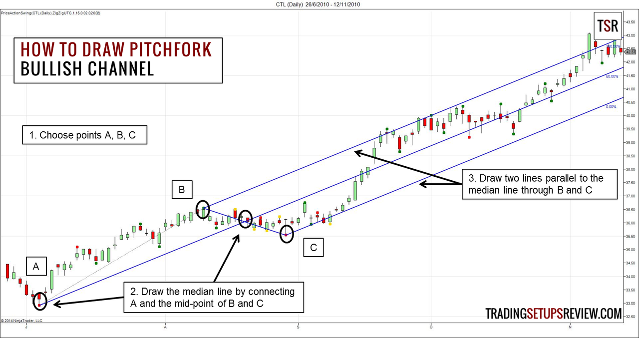
Why does this matter? In practice, the Schiff fork is much more adaptive to choppy, sideways markets. It often provides cleaner signals because it normalizes the entry point. However, it lacks the "magnetic" quality of the traditional fork. The traditional fork’s median line is a very specific, sharp line, which is why it acts as such a strong magnet. The Schiff fork’s median line is often flatter and less steep, offering less resistance. The current consensus in trading circles is to use the traditional fork in strong, clean trends, and the Schiff fork in corrective, pullback phases. Many advanced traders plot both simultaneously: the traditional fork to understand the macro momentum, and the Schiff fork to pinpoint micro entries. It’s a privilege, not a shortcut, to have both tools in your belt—but it requires constant recalibration to avoid analysis paralysis.
As we navigate the labyrinth of charts and candles, it’s easy to forget that these lines are not magical incantations—they are shorthand for human emotion. The Andrews Pitchfork works because it mirrors the way we regress to our own median line. We get too euphoric (upper tine), we get too despondent (lower tine), and most of the time, we hover around our "normal" state (the median line). Looking at a pitchfork is like looking into a distorted mirror of our own collective psyche. When the market hugs the upper tine, it shows our greed; when it crashes through the bottom, it reveals our fear. Using this tool daily forces you to confront your own emotional extremes, to learn that while the trend may break, the pattern of human behavior is remarkably reliable.
In your daily life, the pitchfork offers a broader lesson about structure and patience. We often panic when our finances, relationships, or careers veer away from their "median line." But the pitchfork teaches us that breaking a tine is not the end of the world—it’s the beginning of a new, faster, more volatile move. It whispers that discomfort is a signal, not a failure. If you are holding too tightly to an old routine, you are bound to break through a support tine. The practicality of this tool extends beyond the stock ticker; it’s a philosophy of accepting deviation as part of the design. You cannot have a fork without tines, and you cannot have growth without divergence.
Ultimately, the Andrews Pitchfork is a testament to the beauty of simplicity in a complex world. It asks you to look at big structures, to ignore the microscopic noise, and to commit to a path. The most successful traders—and the most successful humans—don’t move randomly; they draw lines, they mark boundaries, and they understand that the middle path is often the most traveled for a reason. So next time you see a chart, don’t just see a squiggle. See the fork in the road, see the three paths, and decide, with the calm confidence of a modern geometrician, which line you are willing to defend.